
Risograph Print
A two-ink risograph zine poster in fluorescent pink and blue: grainy halftones overprint into violet, layers slide into slightly-off registration, and paste-up type stamps in at tilted angles.
Written and rendered by AI CSS Animations Oct 12, 2026
- Type
- prompt
- Made with
- Claude Opus 5.5 in Claude Code
- Built in
- Canvas
- Topics
- Kinetic type · Shapes
About this style
Risograph machines, made by the Japanese company Riso Kagaku, were built for cheap high-volume duplicating and were taken up by zine makers, artists and small presses. Each color is a separate pass of spot ink through a stencil drum, so overlapping inks mix into new colors, registration drifts a little and solids show grain. That imperfect, tactile look became a signature of independent publishing and is widely imitated in digital illustration.
The prompt
Make a 10-second animated risograph zine poster.

<inputs>
Name: INKWELL. Line: Zine & Small Press Fair. Tagline: "Print it yourself." Three words: CUT, FOLD, STAPLE. Details: Sat 14 Nov · Hall B. Inks: Fluorescent Pink and Blue. Duration: 10s. If I don't give you something, use the default and don't ask.
</inputs>

<direction>
Inks: Fluorescent Pink #FF48B0 and Blue #0078BF (Yellow #FFE800 only if asked) on paper #F4EFE4. Each ink is its own layer, a density mask composited with multiply, so pink over blue prints deep violet.
Type: Bricolage Grotesque 800 for the name (220px, tight); Space Mono 700 for details (26–30px).
Texture is the soul: solids print at 92–100% density through seeded noise with speckle voids; tints are 45° halftone dots at 14px pitch; add patchy unevenness (up to 15%) and a faint roller streak per layer. Generate grain once at load; it's printed, so it doesn't boil.
Registration: each layer sits at its own fixed 2–5px offset and ≤0.15° rotation, so edges show slivers of each ink.
Composition: paste-up energy: a big halftone circle, chunky title, stacked words, rough hand-drawn stars and arrows, everything tilted a seeded ±3° and cropped by the edges.
Motion: elements slide or stamp in on cubic-bezier(0.16, 1, 0.3, 1) over 0.35–0.6s. The signature is the two-pass print: an element lands in one ink, then its second-ink layer slides in from 40px away and snaps into near-registration. Real riso is two inks doing the work of many, flaws kept; the cheap version is a CMYK image with a noise filter.
Banned: gradients, shadows, glow, pure black, grainless fills, perfect registration, colors that aren't inks or overprints.
</direction>

<structure>
0.0–0.8s: a pink halftone circle (700px, cropped by the right edge) prints onto the paper in a top-to-bottom roller wipe.
0.8–1.6s: the name slides in from the left in blue, violet where it crosses the circle; the line follows beneath in Space Mono.
1.6–2.2s: its pink pass slides in from 40px up-right and snaps to a 4px offset.
2.2–3.6s: the three words stamp in, stacked left in alternating inks, 0.35s apart, each scaling 1.04 → 1.
3.6–4.8s: a blue halftone band sweeps across the bottom third, dots ramping 0% → 70%; two pink hand-drawn stars pop on.
4.8–6.0s: the tagline prints in a blue-tint box as a pink arrow scribbles toward it.
6.0–7.2s: details print in pink at bottom-left; two staple marks appear top-left.
7.2–8.0s: every layer drifts 6px out of register and settles back, once.
8.0–10.0s: hold.
For other durations, scale every timestamp proportionally.
</structure>

<build>
One self-contained index.html, CSS and JS inline. Google Fonts via <link> are fine; no other libraries (no three.js: this style is flat). Draw in Canvas 2D, repainting every frame from scratch. Canvas won't fetch fonts itself: await document.fonts.load() for each face, then define window.seek. The stage is 1920×1080 (16:9), scaled to fit the window. Design for 60fps. window.seek(t), t in seconds, must compute every visual from t alone: no CSS transitions or animations, no setTimeout or setInterval, no state carried between frames, and randomness only from a seeded PRNG. Without ?render in the URL, drive seek from requestAnimationFrame so it plays in a browser (loop after a 1s end hold); with ?render, don't start that loop.
</build>

<check>
Before showing me, step through one frame per second: screenshot each and look at it. Fix overlaps, clipped or cramped text, accidental edge collisions, and anything off-style or Banned. Check overprints read violet, grain survives at 1280×720, and type stays legible. Confirm seek(duration) and seek(duration + 1) match, so the final frame holds.
</check>
Ours, and free to use under CC0: copy it, change it, ship it. No credit needed.
Similar prompts
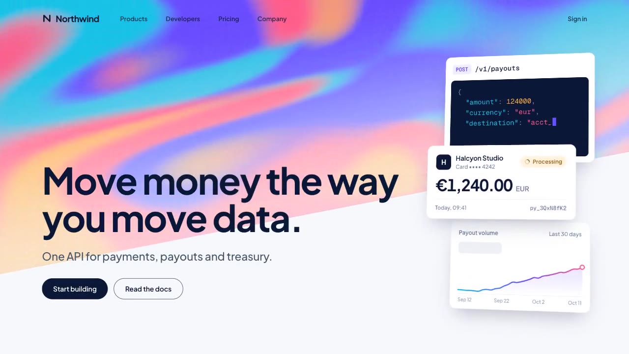
A slow, ribbon-like gradient mesh flows in a skewed band behind sharp headline type, while white payment, API and chart…
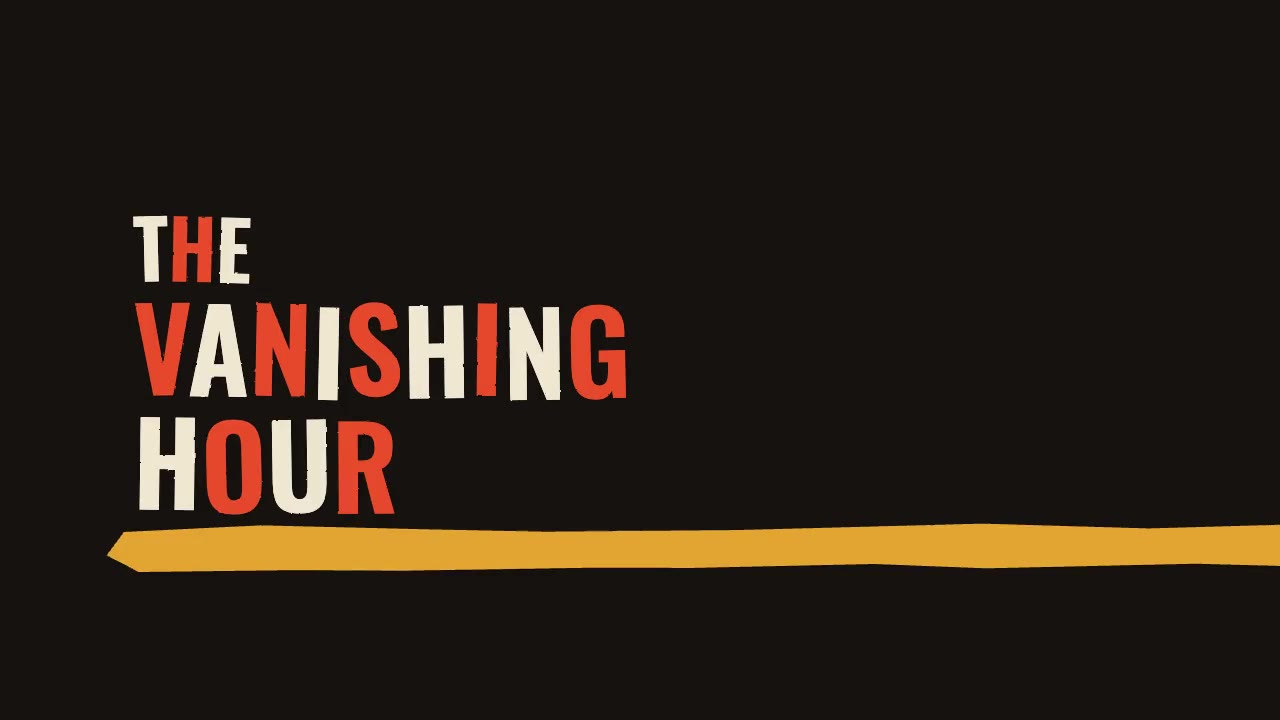
A jazz-tempo film title sequence in flat vermilion, mustard, bone and black: hand-cut paper shards jab in on the beat,…
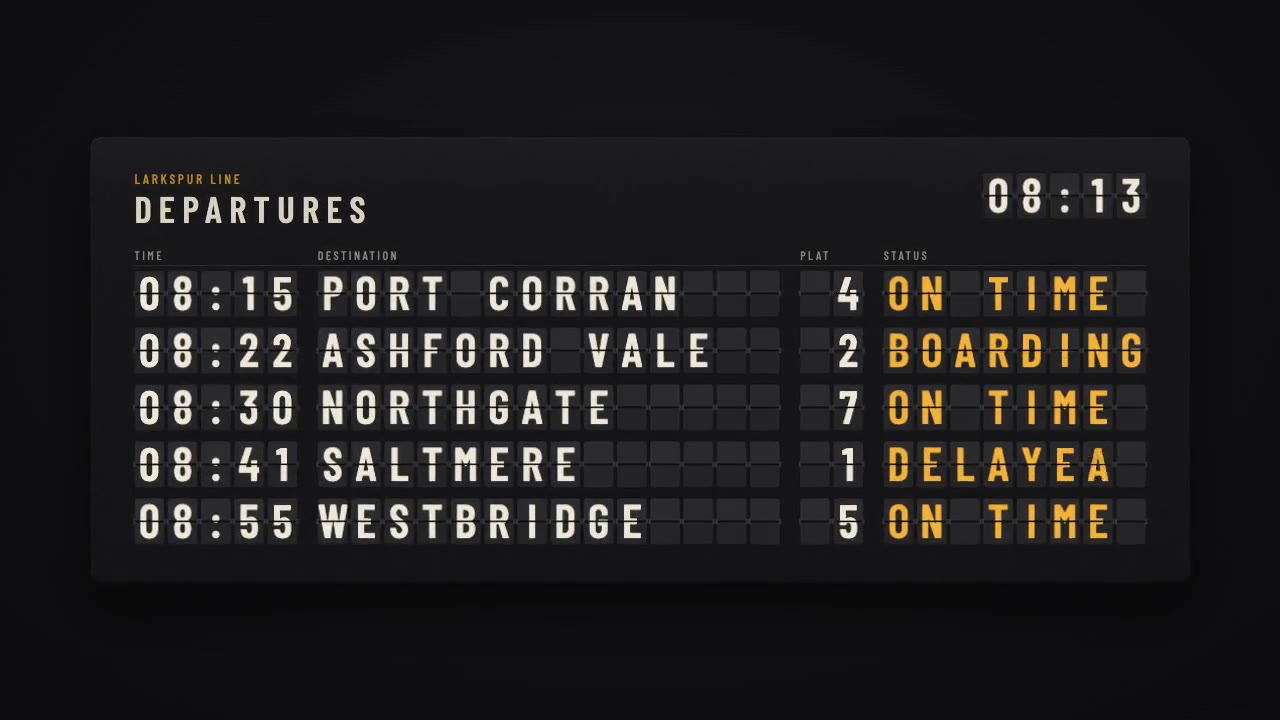
A mechanical station departure board where every flap steps through its drum to land on times, destinations and statuse…
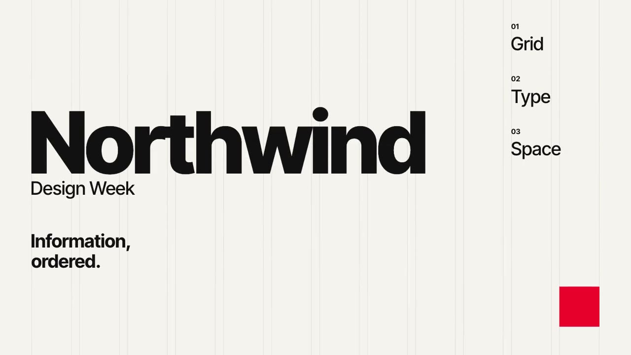
A Swiss-style event poster that builds itself on a visible 12-column grid: grotesque type rises out of baseline masks,…