
Swiss Grid Typography
A Swiss-style event poster that builds itself on a visible 12-column grid: grotesque type rises out of baseline masks, a single red bar anchors the page, and the layout re-flows crisply before the guides fade.
Written and rendered by AI CSS Animations Oct 12, 2026
- Type
- prompt
- Made with
- Claude Opus 5.5 in Claude Code
- Built in
- HTML/CSS
- Topics
- Kinetic type · Shapes
About this style
The International Typographic Style took shape in Switzerland in the 1950s, around the Basel and Zurich schools and designers such as Josef Müller-Brockmann and Armin Hofmann. It rests on mathematical grids, asymmetric layouts, sans-serif type set flush-left and a strict hierarchy of information, with ornament stripped away. Helvetica and Univers both appeared in 1957 out of the same climate. Its insistence on clarity made it the backbone of corporate identity, wayfinding and much of today's interface design.
The prompt
Make a 10-second motion poster in the Swiss International Typographic Style.

<inputs>
Brand: Northwind. Event line: Design Week. Tagline: "Information, ordered." Three words: Grid, Type, Space. Details: 14–18 May · Hall 4. Accent: #E4002B. Duration: 10s. If I don't give you something, use the default and don't ask.
</inputs>

<direction>
Palette: paper #F4F3EE, ink #111111, and the accent red on exactly one element.
Type: Inter Tight (500, 700, 800), flush-left, ragged-right, never centered. Use only this scale: display 260px (leading 0.88, tracking -0.04em), secondary 56px, captions 22px.
Grid: 96px side margins, 72px top and bottom, 12 columns of 122px with 24px gutters, 6 rows of 136px with 24px gutters. Every left edge, top edge and baseline snaps to it. Compose asymmetrically: heavy type mass left, small information right, generous empty fields.
Motion is objective. Elements travel only horizontally or vertically, in whole-column or whole-row steps. Entrances use cubic-bezier(0.2, 0, 0, 1) over 0.4–0.6s; re-layouts use cubic-bezier(0.65, 0, 0.35, 1) over 0.6s; text appears by rising out of a mask at its own baseline, never by fading alone. Staggers 60–90ms.
The real thing gets its power from hierarchy and a grid you can still feel after the guides are gone. The cheap version is big Helvetica on red with effects.
Banned: centered type, diagonal or curved paths, rotation, shadows, gradients, rounded corners, bounce or overshoot, a second red element, icons, typewriter reveals.
</direction>

<structure>
0.0–0.7s: paper only, then 1px ink hairlines at 15% opacity draw the 12 column edges top to bottom, staggered 25ms left to right.
0.7–1.2s: the red bar (columns 1–4, row 2) wipes in from the left on cubic-bezier(0.7, 0, 0.2, 1) over 0.5s.
1.1–2.2s: the brand name in 800 rises out of its mask in rows 3–4 from column 1; the event line follows 90ms later in 500 at 56px, in row 5.
2.2–3.0s: the three words stack in columns 11–12 from row 1, at 56px, each led by a 22px index number (01, 02, 03), staggered 80ms.
3.0–4.4s: hold.
4.4–5.2s: re-layout. The red bar collapses to a 122px square, slides right to column 12, then drops to row 6 (one axis at a time); 100ms after it leaves, the brand name and event line step up one row.
5.2–6.4s: the tagline rises line by line in columns 1–6, row 5, at 56px.
6.4–7.4s: details appear in columns 7–9, row 6, at 22px, each line rising 12px; the hairlines fade out over 0.6s.
7.4–10.0s: hold the finished poster, nothing moving.
For other durations, scale every timestamp proportionally.
</structure>

<build>
One self-contained index.html, CSS and JS inline. Google Fonts via <link> are fine; no other libraries (no three.js: this style is flat). Use absolutely positioned elements, setting transforms, clip-paths and opacity from seek. The stage is 1920×1080 (16:9), scaled to fit the window. Design for 60fps. window.seek(t), t in seconds, must compute every visual from t alone: no CSS transitions or animations, no setTimeout or setInterval, no state carried between frames, and randomness only from a seeded PRNG. Without ?render in the URL, drive seek from requestAnimationFrame so it plays in a browser (loop after a 1s end hold); with ?render, don't start that loop.
</build>

<check>
Before showing me, step through one frame per second: screenshot each and look at it. Fix overlaps, clipped or cramped text, accidental edge collisions, and anything off-style or Banned. Overlay the grid on two frames to confirm every edge still snaps to it. Confirm seek(duration) and seek(duration + 1) match, so the final frame holds.
</check>
Ours, and free to use under CC0: copy it, change it, ship it. No credit needed.
Similar prompts
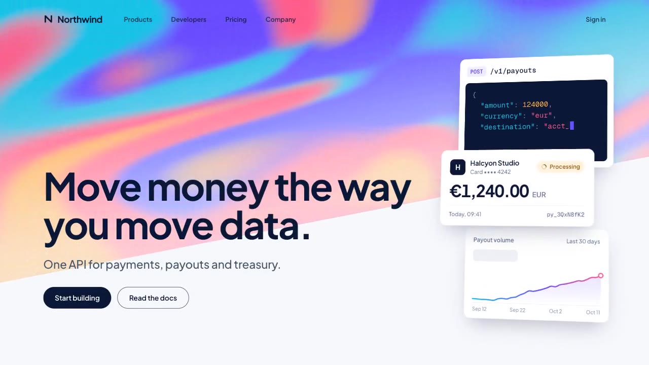
A slow, ribbon-like gradient mesh flows in a skewed band behind sharp headline type, while white payment, API and chart…
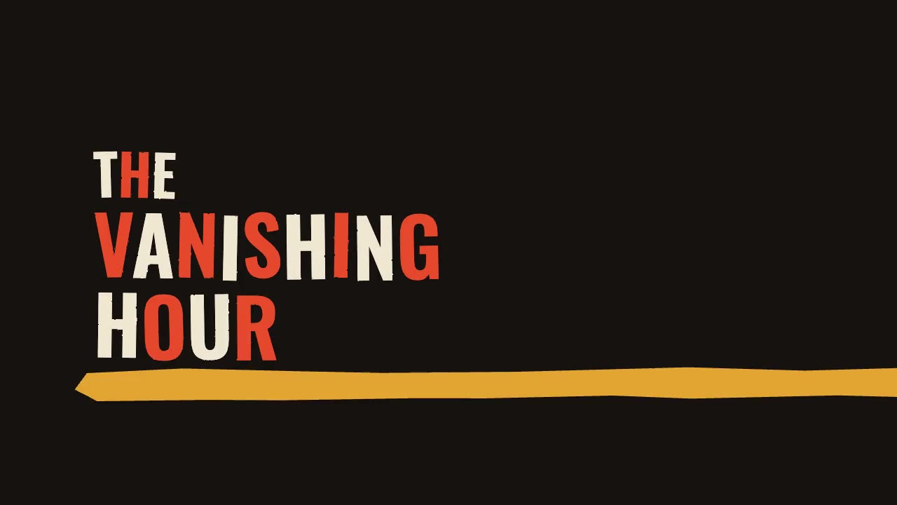
A jazz-tempo film title sequence in flat vermilion, mustard, bone and black: hand-cut paper shards jab in on the beat,…
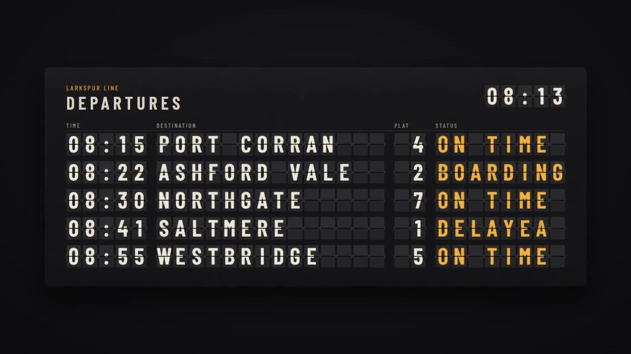
A mechanical station departure board where every flap steps through its drum to land on times, destinations and statuse…
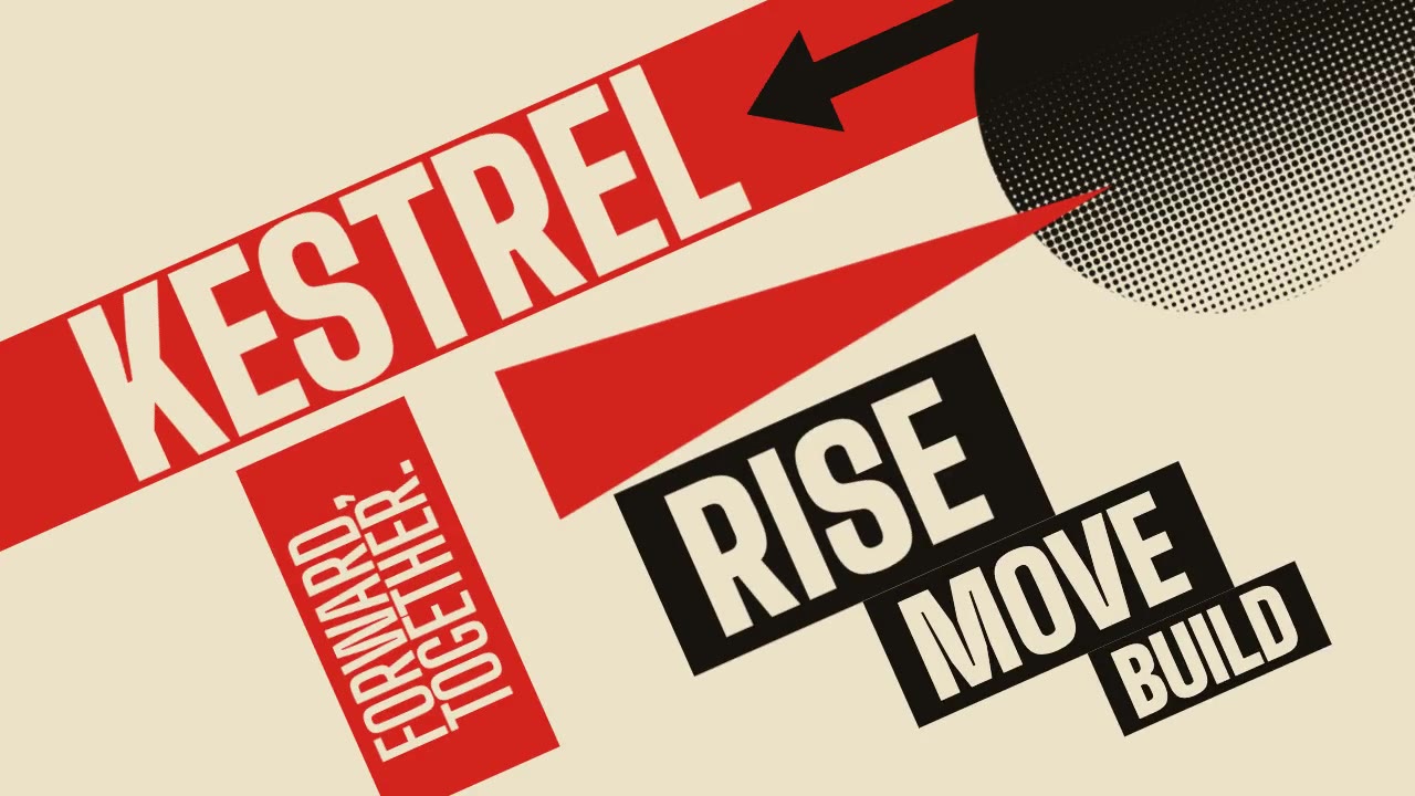
A Constructivist poster in motion: red bars, a wedge piercing a black circle, halftone fields and condensed uppercase t…