
Lock Screen Notifications
A phone on a terracotta stage wakes to a dusk-hills wallpaper: frosted notifications spring up and push each other, three messages tuck into a stack and fan open on a tap, and a live delivery card rolls its minutes down in step with the clock.
Written and rendered by AI CSS Animations Oct 16, 2026
- Type
- prompt
- Made with
- Claude Opus 5.5 in Claude Code
- Built in
- HTML/CSS
- Topics
- Phone · Product UI
About this style
The lock screen is where most phone notifications are first seen, and mobile operating systems have steadily refined how alerts arrive, group by app and expand on demand. Newer systems also show persistent cards that update in place, such as a delivery's progress or a ride's arrival time. The motion carries meaning: frosted cards push each other aside, groups collapse into layered stacks, and springs make the glass feel physical.
The prompt
Make a 10-second phone lock screen demo: notifications arrive, stack into a group, the group expands, and a live delivery card updates in place.

<inputs>
If I don't give you something, use the default and don't ask.
- Time: 7:39, turning 7:40; Friday 16 October
- Murmur, three messages from Priya Anand: "Bringing the board games tonight", "Can you grab snacks on the way?", "Cass is coming too!"
- Pursewell: "Paid $46.20 to Little Saffron"
- Dashbird live card for Little Saffron: "Picked up", then "On the way"; arriving 7:52
- Length: 10 seconds
</inputs>

<direction>
Stage: terracotta #E2683C with 3% grain and one soft shadow. Phone: 450×960 (#0E0F12, 72px radius), centered, starting at rotateY(16°) rotateX(4°) and easing flat by 8s.
Wallpaper, drawn once: dusk hills as stacked, smoothed sine bands (sky #F2B38A, hills #7A4A6B, #4A3463, #2B2550, foreground #171833), a blurred sun, grain, and a dark wash low down so white text holds 4.5:1.
Type: Outfit: clock 132px at weight 200 with fixed-width digits, date 26px, titles 22px/600, body 21px.
Cards: 410×88, 26px radius, frosted (backdrop blur over 20% white), each with a 40px icon drawn in code. The list sits above the live card, newest at the bottom; arrivals push older cards up, never into the clock. A second message from one app tucks the older card behind it (peeking 10px and 20px at 0.94 and 0.88 scale) with a "+N" chip; expanding fans them into a column under a "Murmur" header.
Live card: 410×140 at the bottom in darker glass: name, status, the ETA (Outfit 300, 44px) and a four-node track with a drawn scooter. It updates in place: digits roll vertically over 180ms, the status slides, the scooter glides.
Motion is physical: arrivals rise from 40px below on a closed-form spring (stiffness 260, damping 22, about 6% overshoot) and pushed cards ride the same spring; the fan uses stiffness 220, damping 24, 60ms apart. A tap is a faint white circle that shrinks and fades.
Premium is weight and continuity: cards that push each other, a stack like paper under paper, minutes that agree with the clock. Cheap is cards fading in one by one.
Banned: real phone brands, real app icons or system glyphs, banners dropping from the top, text under 4.5:1 contrast, emoji, anything flashing more than 3 times per second.
</direction>

<structure>
0.0–1.0s: the screen wakes from black; date and clock rise 12px into place.
1.0–1.8s: the live card springs up: "Picked up", 13 min.
1.8–2.5s: Priya's first message arrives.
2.5–3.2s: Pursewell arrives below it, pushing it up.
3.2–4.0s: her second message arrives; the Murmur group slides into the newest slot and tucks the first behind ("+1").
4.0–4.6s: the third joins ("+2").
4.6–5.0s: a tap; the stack dips to 0.97.
5.0–6.0s: the group fans open, pushing Pursewell up.
6.0–6.8s: the clock rolls to 7:40 and, in step, the ETA to 12 min; the status slides to "On the way"; the scooter glides on.
6.8–8.4s: the phone settles flat.
8.4–10.0s: hold.
For other lengths, scale the gaps between arrivals, never the springs; hold at least 1.2s.
</structure>

<build>
One self-contained index.html, CSS and JS inline; Google Fonts via <link>, awaited with document.fonts.load() before window.seek is defined; no other libraries. Use HTML/CSS with inline SVG icons and a canvas painted once for the wallpaper. Springs are closed-form; one retargeted mid-motion starts from its current offset and velocity. The stage is 1920×1080 (16:9), scaled to fit the window; design for 60fps. window.seek(t), t in seconds, must compute every visual from t alone: no CSS transitions or animations, no setTimeout or setInterval, no state carried between frames, randomness only from a seeded PRNG. Without ?render in the URL, drive seek from requestAnimationFrame (loop after a 1s end hold); with ?render, don't start that loop.
</build>

<check>
Before showing me, step through one frame per second: screenshot each and look at it. Fix overlaps, clipped or cramped text and anything off-style or Banned. Check no card touches the clock, each +N matches the hidden count, the clock plus the ETA always makes 7:52, and all text stays legible. Confirm seek(10) and seek(11) match, so the final frame holds.
</check>
Ours, and free to use under CC0: copy it, change it, ship it. No credit needed.
Similar prompts
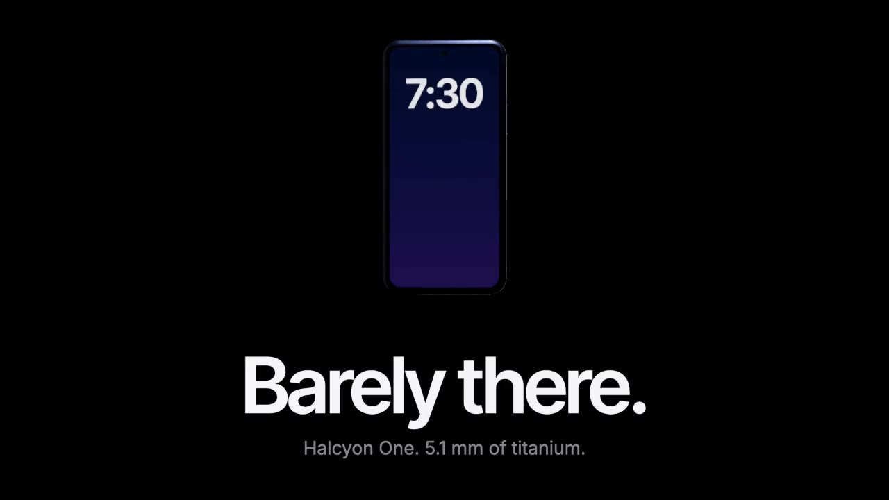
A device built in three.js rises out of total darkness while a softbox reflection glides along its titanium edge, then…
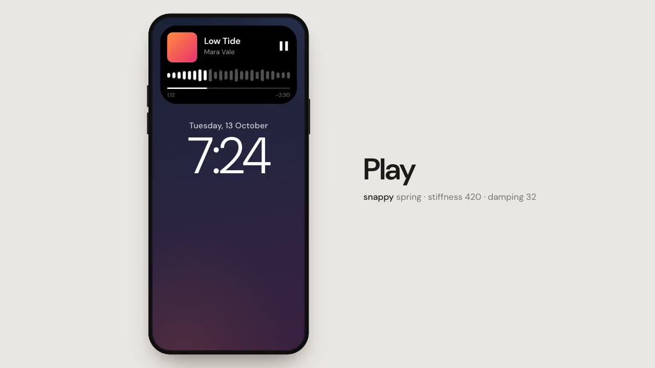
One black pill on a phone screen morphs into a notification, a live card and a music player on closed-form springs that…
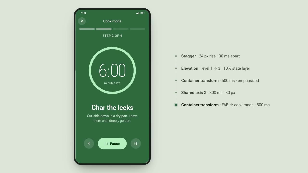
A recipe app demonstrates Material-style motion: a card expands into a full screen, tabs switch on a shared axis, a FAB…
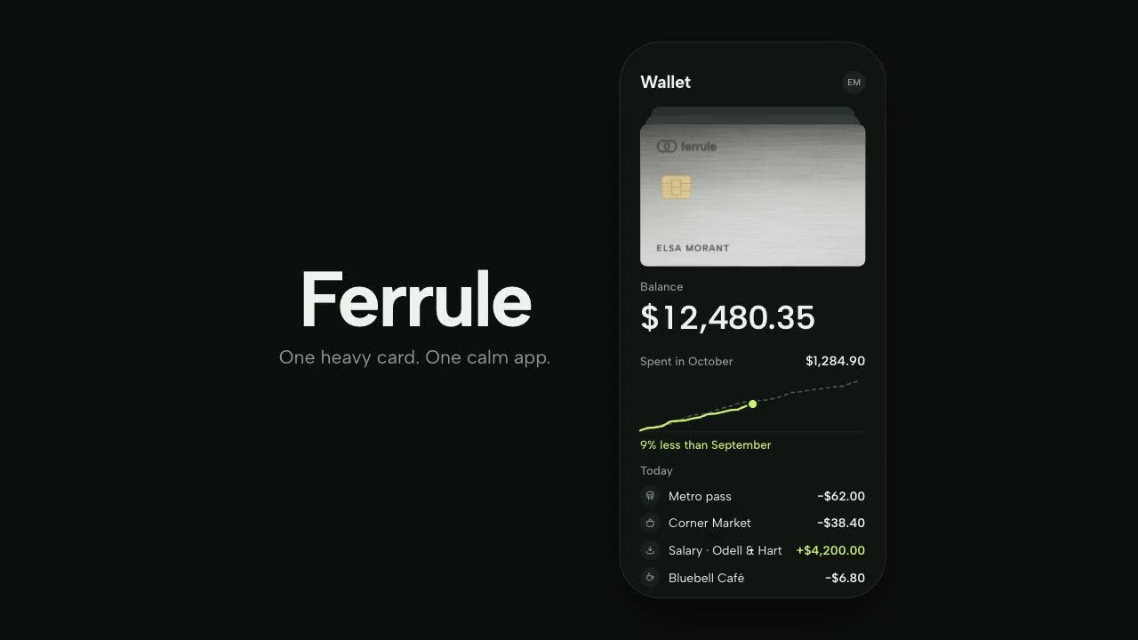
A brushed-steel card turns slowly in real 3D as a softbox highlight crawls across it, flies into a phone's wallet stack…
More like this on the motion design inspiration board: UI animation inspirationApp animation inspiration