
Material Container Transform
A recipe app demonstrates Material-style motion: a card expands into a full screen, tabs switch on a shared axis, a FAB becomes cook mode, and a side column labels each pattern.
Written and rendered by AI CSS Animations Oct 12, 2026
- Type
- prompt
- Made with
- Claude Opus 5.5 in Claude Code
- Built in
- HTML/CSS
- Topics
- Product UI · Phone · Explainer
About this style
Material-style motion is built from a small set of named transition patterns, such as the container transform, shared axis and fade through, paired with emphasized easing curves that decelerate sharply. A container transform keeps one surface continuous as it grows from a card into a screen, so people always know where content came from. Teams building on that design system use these patterns because they make navigation feel spatial and consistent.
The prompt
Make a 10-second Material-style motion film: a container transform, a shared-axis tab switch and clear elevation, in a recipe app.

<inputs>
If I don't give you something, use the default and don't ask.
- App: Fennel (recipes)
- Tagline: "Cook with confidence."
- Seed color: #2F6A3F
- Featured recipe: "Charred leek, miso butter" · 25 min · serves 4
- Length: 10 seconds
</inputs>

<direction>
- Tonal palette: primary #2F6A3F, on-primary #FFFFFF, primary container #B4F1BE, surface #F6FBF2, container #EAEFE6, container high #E4E9E0, on-surface #171D18, on-surface variant #414941. Stage: #DDE5D9.
- Type: Roboto Flex, scaled for video: body 22px, titles 28px, headlines 44px, wordmark 76px.
- Layout: the phone screen (460×960, 36px radius) left of center. Right: an annotation column labels each pattern with its spec ("Container transform · 500 ms · emphasized"), 26px, on-surface variant.
- Home in code: top app bar, search bar, filter chips and a two-column grid of 16px-radius recipe cards, food painted with layered radial gradients. The detail screen carries an extended FAB, "Start cooking".
- Easing: emphasized decelerate cubic-bezier(0.05, 0.7, 0.1, 1) entering; emphasized accelerate cubic-bezier(0.3, 0, 0.8, 0.15) exiting; standard cubic-bezier(0.2, 0, 0, 1) in place. Durations 200–500 ms.
- Container transform: one surface animates its bounds, radius (16 → 0) and color (container high → surface). Card content fades out by 30%, screen content fades in from 35%, and the image grows continuously into the hero.
- Shared axis (X): outgoing slides 30px and fades by 35%; incoming slides in from the opposite side; the tab indicator slides and resizes.
- Elevation: a pressed card rises from level 1 to 3 (shadow plus tonal shift) under a 10% state layer, rippling from a 48px touch indicator.
- Premium is spatial continuity: you always know where a surface came from.
Banned: linear easing, symmetric ease-in-out entrances, content flying without a container, unrelated cross-fades, frosted blur, text shadows, a default purple palette, emoji, real company names.
</direction>

<structure>
- 0.0–1.0: Home builds: top bar, chips, then cards rising 24px, 30 ms apart.
- 1.0–1.6: A touch on the featured card: state layer, ripple, elevation 1 → 3.
- 1.6–2.2: Container transform (500 ms) into the detail screen.
- 2.2–4.0: Hero, title and meta chips, then ingredient rows 40 ms apart.
- 4.0–5.2: Shared-axis switch from Ingredients to Steps (300 ms).
- 5.2–6.4: The FAB transforms into full-screen cook mode with a timer.
- 6.4–7.8: Back: cook mode collapses into the FAB, then the detail returns into its card (emphasized accelerate, 350 ms).
- 7.8–10.0: Home rests; the annotations resolve into "Fennel" and the tagline. Hold.
For other lengths, add rest between patterns; never stretch a transition past 600 ms.
</structure>

<build>
- One self-contained index.html (inline CSS and JS) with a fixed 1920×1080 (16:9) stage scaled to fit the window; design for 60fps.
- window.seek(t), t in seconds, sets every visual from t alone: no CSS transitions or animations, no setTimeout/setInterval, no state carried between frames. Randomness comes from a seeded PRNG; springs are closed-form functions of time.
- Without ?render in the URL, drive seek from requestAnimationFrame so it plays in a browser; with ?render, don't start that loop.
- Google Fonts via <link> are fine. Build it in HTML/CSS with inline SVG; no canvas or three.js needed.
</build>

<check>
Before showing me, screenshot seek(0) through seek(10), one frame per second, and look at each. Fix overlaps, clipped or cramped text, and anything generic. Also step each container transform at 0.1 s: one continuous surface, nothing outside it, annotations matching the screen. Confirm the final frame holds.
</check>
Ours, and free to use under CC0: copy it, change it, ship it. No credit needed.
Similar prompts
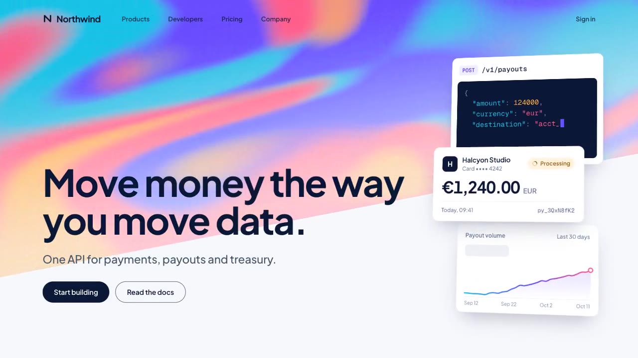
A slow, ribbon-like gradient mesh flows in a skewed band behind sharp headline type, while white payment, API and chart…
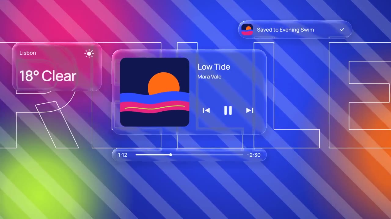
Glass panels with real refraction float over vivid, striped color: their rims bend what's behind them, two buttons fuse…
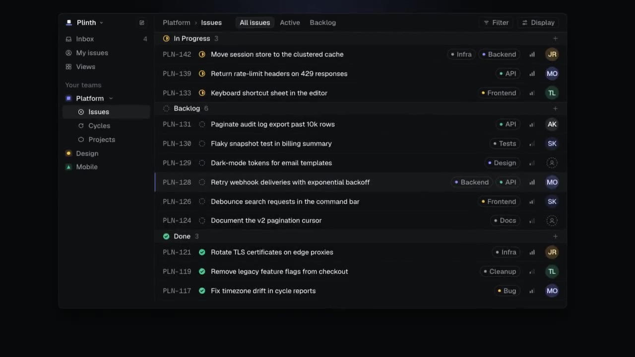
A dark-mode work tool drawn in hairlines and quiet radial glows: issue rows populate, ⌘K opens a command menu, a comman…
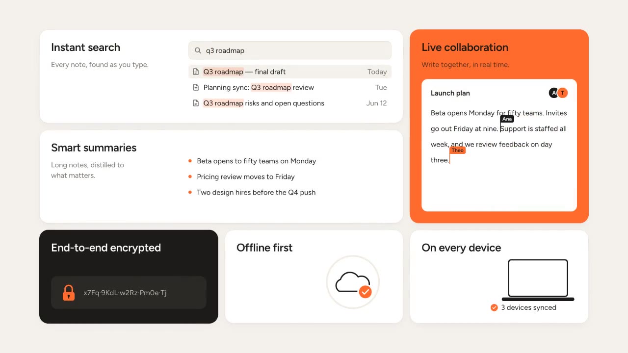
Rounded tiles spring into a bento grid on warm paper, each acting out one feature in a small animation, then the tiles…