
Isotype Pictograms
A 1920s Vienna-style picture chart on cream paper: flat walkers, cyclists, trams and cars print one by one, each standing for 1,000 workers, comparing 1925 with 1955 in rows you read by length, with pale ghost figures showing what changed.
Written and rendered by AI CSS Animations Oct 16, 2026
- Type
- prompt
- Made with
- Claude Opus 5.5 in Claude Code
- Built in
- SVG
- Topics
- Charts
About this style
Isotype began in 1920s Vienna as the Vienna Method of Pictorial Statistics, developed by Otto Neurath at the Gesellschafts- und Wirtschaftsmuseum with Marie Reidemeister (later Marie Neurath) and the artist Gerd Arntz. Its rules are strict: one symbol stands for a fixed quantity, a larger amount is shown by more symbols rather than bigger ones, and the symbols are simple flat silhouettes in a few colors. The name Isotype, for International System of Typographic Picture Education, came in the 1930s. Its ideas run through modern infographics, public signage and the pictogram charts in reports and journalism.
The prompt
Make a 10-second Isotype chart in the 1920s Vienna manner: rows of identical flat pictograms, each standing for 1,000 people, compare how a fictional town got to work in 1925 and in 1955.

<inputs>
- Title: "How Ardlow gets to work". Subtitle: "Workers by way of travel, 1925 and 1955". Ardlow is a fictional town.
- Key: one walking figure, "= 1,000 workers".
- Data, thousands of workers (1925, 1955): On foot 8.5, 5 · Bicycle 6, 7.5 · Tram 4, 8 · Motor car 1.5, 5.5.
- Totals: 20,000 in 1925 and 26,000 in 1955. Change figures: on foot −3,500, bicycle +1,500, tram +4,000, motor car +4,000, each followed by "since 1925".
- Footnote: "Fictional figures for a fictional town."
- Length: 10 seconds.
If I don't give you something, use the default and don't ask.
</inputs>

<direction>
Palette: paper #EEE6D1 with a seeded print grain at 3%; ink #1C1B19; one flat color per category: on foot ink #1C1B19, bicycle blue #2D5A88, tram red #C0392B, motor car ochre #B98A2E; secondary text #6E675A.
Type: "League Spartan", a geometric sans in the spirit of the period. Title 700, 64px, sentence case; subtitle 400, 28px; year headers 700, 72px; row labels 500, 30px; key and change figures 500, 24px; totals 700, 40px with "workers" in 500; footnote 400, 20px. Numbers use tabular figures.
The pictograms carry the style. Design each once on a 16-unit grid at 4px per unit, as a flat silhouette standing on the baseline, 56px tall, facing right, with no outlines, no faces and nothing finer than one unit:
- On foot: a striding figure: round head, tapered torso, legs in a stride.
- Bicycle: two thick rings (3-unit wheels) under a seated rider built from the walker's parts.
- Tram: a box body with rounded top corners, four window cutouts, a trolley pole and two small wheels.
- Motor car: a 1950s body with a two-window cabin and two wheels.
All four share baseline and height and have roughly equal ink area, so no category looks heavier by drawing alone.
The method's rules: one figure is always 1,000 workers; more is shown by more figures, never bigger ones; figures stand in rows at a fixed 72px pitch, and both years start their rows at the same offset so rows compare by length; a half is a figure cut by a vertical edge, keeping its left half.
Layout: title top-left at x 120, baselines y 132 and 178. Key right-aligned at x 1800, baseline y 132. Year headers "1925" at x 440 and "1955" at x 1160, baseline y 290, over a 1.5px ink rule at y 312 from x 120 to 1800. Rows with figure baselines at y 400, 520, 640 and 760; row labels at x 120, each with its change figure beneath in the row's color. The 1925 block runs right from x 440, the 1955 block from x 1160, divided by a 1.5px ink rule at x 1124. A second rule at y 820; totals under each block at baseline y 880. Footnote bottom-left at x 120, baseline y 1000.
Showing change: in the 1955 block each row's 1925 count first appears as ghost figures, the same flat silhouettes at 16% ink, and the 1955 figures print over them. Losses read as ghosts left bare; gains get a 3px underline in the row color, 10px below the baseline, spanning only the figures past the ghosts.
Motion is counting, the rhythm of a press. Each figure prints in reading order: ink opacity 0 → 1 and scale 1.08 → 1 over 0.12s on cubic-bezier(0.2, 0.8, 0.2, 1), 60ms apart; a half figure comes last in its row, its cut edge wiping left to right. Text fades in over 0.3s while rising 8px; rules draw left to right over 0.4s. Nothing slides, bounces or grows to show quantity.
The real thing reads in seconds without numbers: identical figures, tidy rows, color only for category. The cheap version scales one icon up to show a bigger amount, or pastes clip-art people onto a bar chart.
Banned: resizing figures to encode quantity, outlines on figures, gradients, shadows, 3D, faces or facial detail, figures facing different ways, icon fonts, clip-art, emoji, colors outside this palette, anything flashing more than 3 times per second.
</direction>

<structure>
0.0–0.8s: paper; the title and subtitle fade up; the key's walker prints, then its text.
0.8–1.4s: the header rule draws; year headers and row labels fade in, 80ms apart.
1.4–3.4s: the 1925 block prints row by row, 60ms per figure (21 figures, two of them halves).
3.4–3.8s: a pause.
3.8–4.2s: the 1925 counts appear as ghosts in the 1955 block, row by row, 80ms apart.
4.2–6.4s: the 1955 figures print over the ghosts, row by row; on foot stops at five, leaving three and a half ghosts bare; the other rows run past their ghosts.
6.4–7.4s: change figures fade in under the row labels, 120ms apart; the gain underlines draw left to right.
7.4–8.4s: the lower rule draws; the totals count up to 20,000 and 26,000; the footnote fades in.
8.4–10.0s: hold, completely still.
For other lengths, keep 60ms per figure and give extra time to the pause and the hold.
</structure>

<build>
One self-contained index.html, CSS and JS inline. Google Fonts via <link> are fine; no other libraries. Draw in inline SVG whose attributes seek sets directly; no canvas or three.js needed. Await document.fonts.load() for every face before defining window.seek. The stage is 1920×1080 (16:9), scaled to fit the window. Design for 60fps. window.seek(t), t in seconds, must compute every visual from t alone: no CSS transitions or animations, no setTimeout or setInterval, no state carried between frames, and randomness only from a seeded PRNG. Define each pictogram once as a <symbol> and place it with <use>; a half is the same symbol under a clipPath. Without ?render in the URL, drive seek from requestAnimationFrame so it plays in a browser (loop after a 1s end hold); with ?render, don't start that loop.
</build>

<check>
Before showing me, step through one frame per second: screenshot each and look at it. Fix overlaps, clipped or cramped text, accidental edge collisions, and anything off-style or Banned. Count the figures in every row of both blocks against the data, with halves cut vertically and no figure resized. Check that both blocks share baselines and pitch, the ghosts sit exactly under the 1955 figures, underlines span only the gains, and the totals are right. Confirm seek(duration) and seek(duration + 1) match, so the final frame holds.
</check>
Ours, and free to use under CC0: copy it, change it, ship it. No credit needed.
Similar prompts
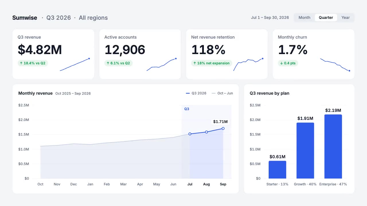
A light analytics dashboard builds itself from fictional data that adds up: counters roll on tabular figures, sparkline…
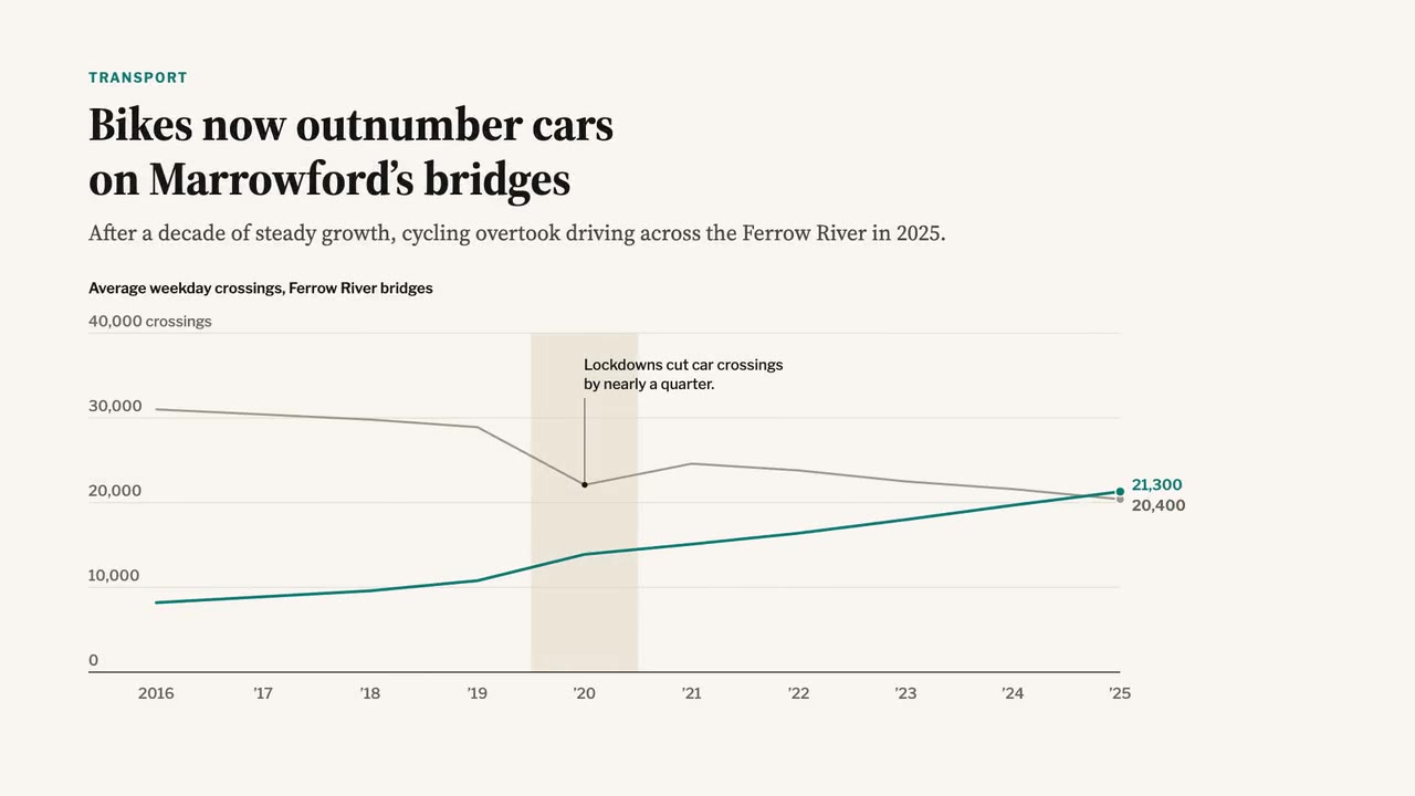
A newspaper-grade animated chart: serif headline and dek, a two-line chart that draws year by year, a shaded 2020 band,…
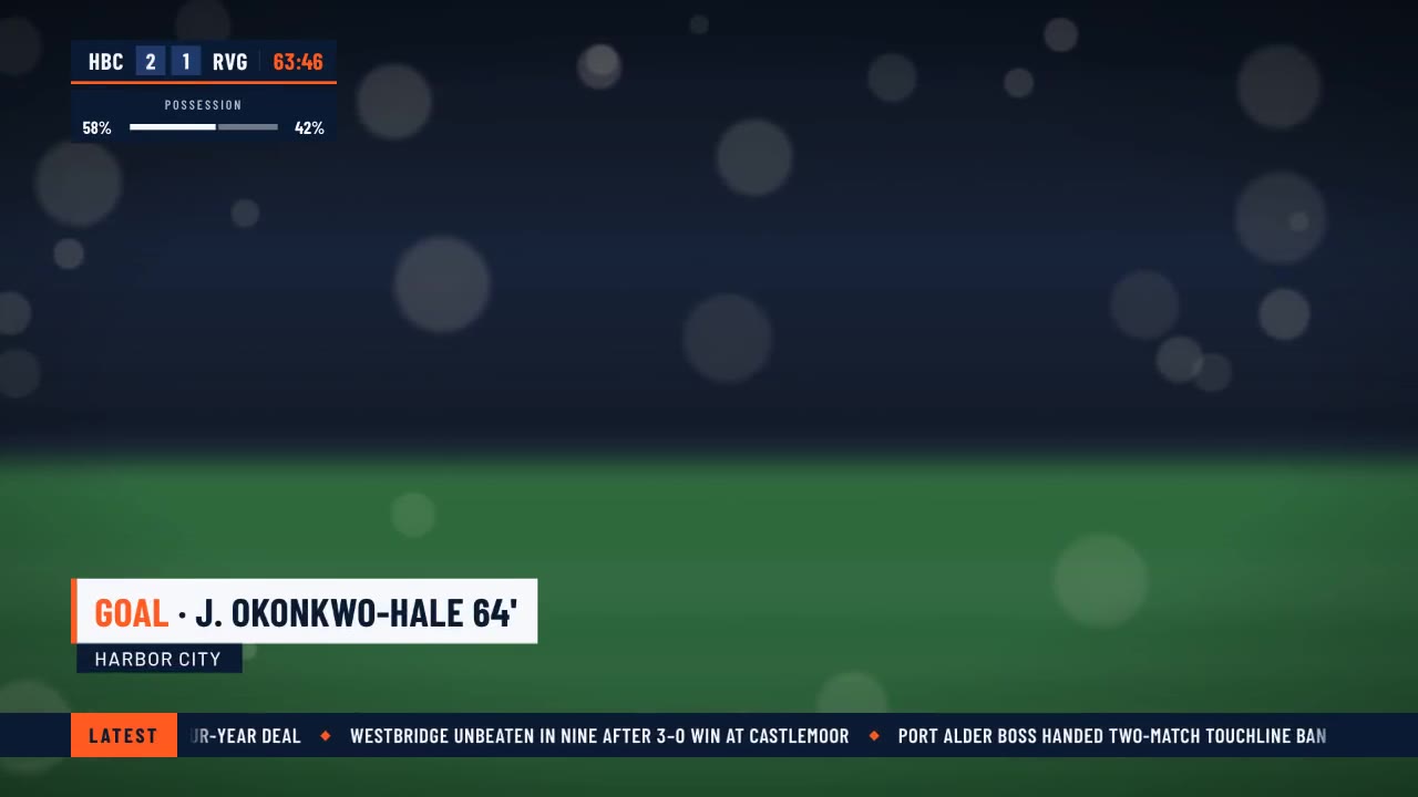
A crisp live-sports graphics package over a soft-focus stadium feed: score bug with running clock, layered lower third,…
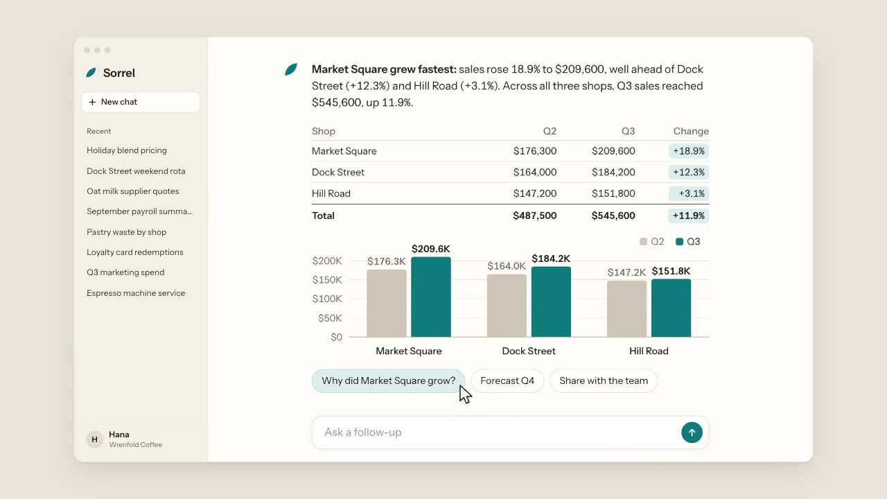
A warm, light chat app: a cursor types a question about three coffee shops, the assistant streams its answer word by wo…
More like this on the motion design inspiration board: Data visualization inspiration