
De Stijl Composition
A De Stijl painting builds and rebalances itself on warm white: black bars draw on, red, yellow and blue planes wipe in, then one line at a time slides on a strict horizontal or vertical axis until the composition resolves into an exhibition poster with a title built from rectangles.
Written and rendered by AI CSS Animations Oct 16, 2026
- Type
- prompt
- Made with
- Claude Opus 5.5 in Claude Code
- Built in
- SVG
- Topics
- Shapes · Kinetic type
About this style
De Stijl was a Dutch movement founded in 1917 around the magazine of the same name, edited by Theo van Doesburg, with Piet Mondrian among its central painters. Mondrian's Neo-Plasticism limited painting to horizontal and vertical black lines, rectangles of the three primaries, and white, grey and black, held in asymmetric balance. The group applied the same rules to furniture, architecture and rectilinear lettering, most famously in Gerrit Rietveld's Red and Blue Chair. Its grids and primary planes still inform posters, branding and interface layouts.
The prompt
Make a 10-second De Stijl composition that rebalances itself and resolves into an exhibition poster.

<inputs>
Title: BALANCE (4–8 letters read best; it is built from rectangles, not set in a font). Subtitle: "Line, plane and primary color". Venue: Ramsloo Gallery. Dates: 3 March – 9 June. Duration: 10s. If I don't give you something, use the default and don't ask.
</inputs>

<direction>
Palette: canvas white #F2F0E9 (never pure white), black #141414, red #D52A1F, yellow #F3C01C, blue #1D3E92. Flat fills, each plane with a faint seeded brush texture (short strokes along its longer side, ±2% lightness) so it reads painted, not printed.
Model: six named lines, each a 24px black bar with one moving position (its left or top edge, px) and two ends attached to another line or the stage edge. Planes are the cells between lines, so bars and planes stay locked together as lines move: no gaps or overlaps, ever.
- H2 runs the full width; V1 the full height; H1 from the left edge to V1; V2 from the top edge to H2; H3 from V2 to the right edge; V3 from H2 to the bottom edge.
- Red fills left edge→V1 × top→H1; yellow fills V2→right edge × top→H3; blue fills V3→right edge × H2→bottom. Every other cell is canvas white.
- Start: V1 760, H1 480, H2 820, V2 1500, H3 560, V3 1640. Final: V1 300, H1 620, H2 760, V2 1500, H3 200, V3 1180. The start is top-heavy; the final sets a broad blue counterweight bottom right and opens a white field (x 324–1500, y 0–760) for the title.
Lettering: the title is built only from black rectangles, like De Stijl's rectilinear alphabets: letters 5 modules wide and 7 tall on a 20px module, strokes one module thick, one module apart, no curves or diagonals (N steps down in one-module stairs). BALANCE spans x 420–1240, y 300–440. Subtitle: Work Sans 500, 34px, x 420, baseline 520. Venue and dates: Work Sans 700, 24px, uppercase, tracking 0.12em, x 372, baselines 880 and 920, in the white cell under H2.
Motion is strict, like tape laid and pressed down. One line moves at a time, along its own axis only, on cubic-bezier(0.7, 0, 0.2, 1) over 0.5s, then everything rests at least 0.25s; every rest is a finished, balanced painting. Bars draw on by extending from one end (0.3s, cubic-bezier(0.5, 0, 0.2, 1)). Planes wipe in along one axis out of their longest bar (0.4s). Letter rectangles extend from their top or left end (0.12s, 20ms apart, letters 80ms apart). Text rises 12px out of a mask at its baseline over 0.4s.
The real thing is unequal planes held in tense balance by a few black bars; the cheap version is a random grid of primary rectangles popping on at once.
Banned: diagonals, curves, rounded corners, gradients, shadows, any mixed color, two lines moving at once, fades or scale-ins, bounce or overshoot, a font for the title, anything flashing more than 3 times per second.
</direction>

<structure>
0.0–0.3s: canvas white only.
0.3–1.5s: bars draw on in painting order, 0.18s apart: H2 (left to right), V1 (top down), H1, V2, H3, V3.
1.5–2.5s: red, yellow, then blue wipe in, 0.3s apart.
2.5–2.9s: rest: the first painting.
2.9–6.7s: the rebalance, five 0.5s moves with 0.26s rests: V1 760 → 300 (red narrows), H1 480 → 620 (red grows tall), H3 560 → 200 (yellow lifts and shrinks), V3 1640 → 1180 (blue widens), H2 820 → 760 (the lower band rises).
6.7–7.8s: the title builds letter by letter, rectangles extending into place.
7.8–8.5s: the subtitle rises; venue and dates follow 120ms later.
8.5–10.0s: hold, nothing moving.
For other durations, scale every timestamp proportionally, keeping each move at 0.4s or longer.
</structure>

<build>
One self-contained index.html, CSS and JS inline. Google Fonts via <link> are fine; await document.fonts.load() for each face before defining window.seek. No other libraries (no three.js: this style is flat). Draw in inline SVG: one <rect> per bar, plane and letter stroke, attributes set from seek. The stage is 1920×1080 (16:9), scaled to fit the window. Design for 60fps. window.seek(t), t in seconds, must compute every visual from t alone, clamping past the end to the last frame: no CSS transitions or animations, no setTimeout or setInterval, no state carried between frames, and randomness only from a seeded PRNG. Without ?render in the URL, drive seek from requestAnimationFrame so it plays in a browser (loop after a 1s end hold); with ?render, don't start that loop.
</build>

<check>
Before showing me, step through one frame per second: screenshot each and look at it. Fix overlaps, clipped or cramped text, accidental edge collisions, and anything off-style or Banned. Check that no white sliver ever opens between a plane and its bars, every bar ends exactly on another bar or the stage edge, and every rest frame is balanced on its own. Read the title on a 1280×720 frame: every letter must be recognizable. Confirm seek(duration) and seek(duration + 1) match, so the final frame holds.
</check>
Ours, and free to use under CC0: copy it, change it, ship it. No credit needed.
Similar prompts
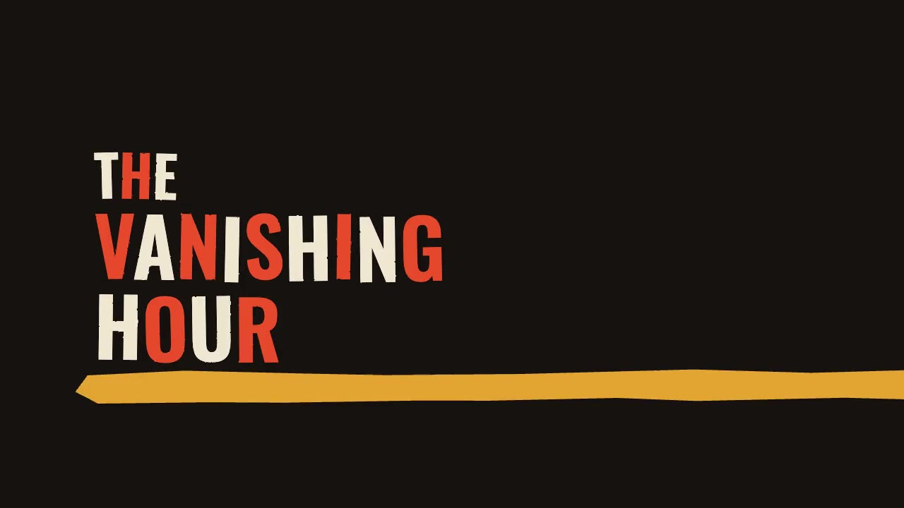
A jazz-tempo film title sequence in flat vermilion, mustard, bone and black: hand-cut paper shards jab in on the beat,…
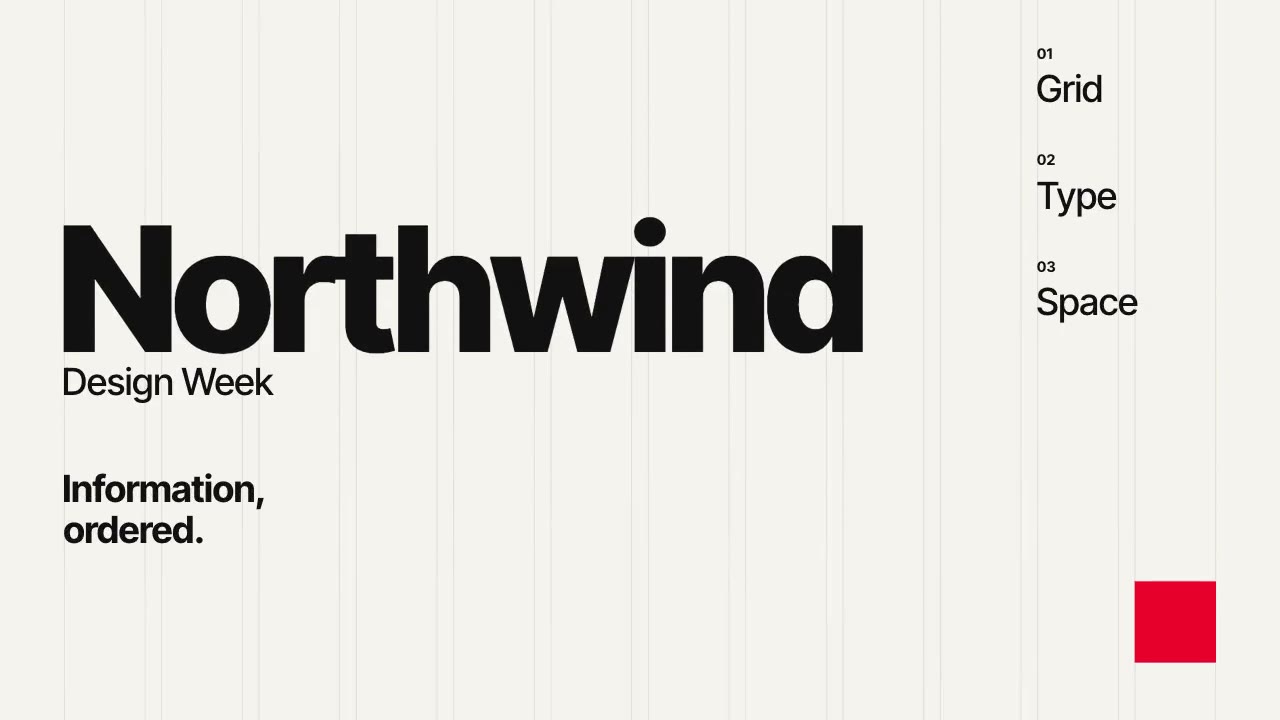
A Swiss-style event poster that builds itself on a visible 12-column grid: grotesque type rises out of baseline masks,…
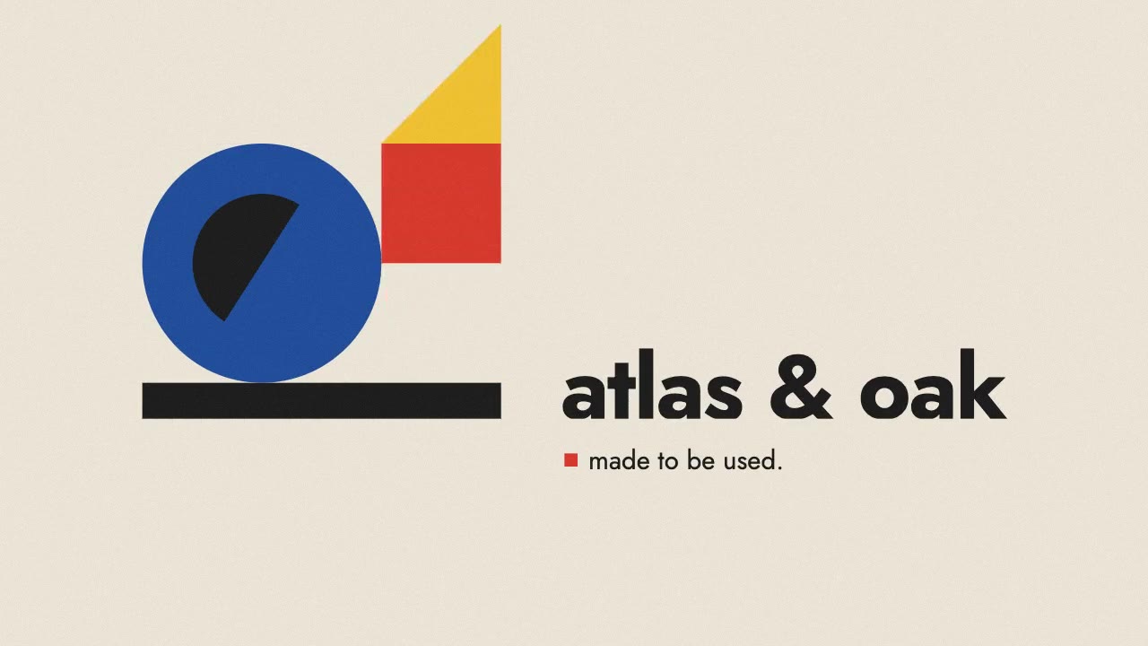
A primary-colored circle, square and triangle roll, drop and turn into place on a black bar, assembling a constructed B…
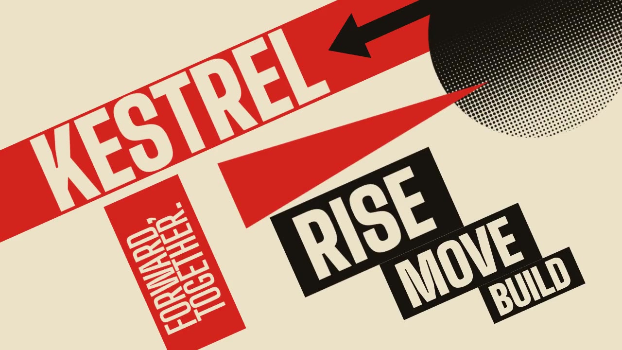
A Constructivist poster in motion: red bars, a wedge piercing a black circle, halftone fields and condensed uppercase t…
More like this on the motion design inspiration board: Kinetic typography inspirationMotion graphics inspiration