
Victorian Playbill
A sepia circus playbill sets itself line by line in a crowd of period display faces: a red ribbon banner unfurls, a shaded headline lands between two hatched tent engravings, and stars, Oxford rules and corner fleurons fill out the bill.
Written and rendered by AI CSS Animations Oct 16, 2026
- Type
- prompt
- Made with
- Claude Opus 5.5 in Claude Code
- Built in
- SVG
- Topics
- Kinetic type · Line art
About this style
Nineteenth-century playbills and circus bills were set by jobbing printers from whatever display type the shop owned: fat faces, Tuscans, Egyptians (slab serifs), wide and condensed letters, and outline or shaded faces, often many in a single bill. Each line was centered and sized to its importance and to the width of the sheet, then separated from the next by rules, stars or borders. Bills were printed quickly on cheap paper in one or two inks and pasted up around town ahead of the show. The look survives in vintage-styled packaging, labels and theater posters.
The prompt
Make a 10-second Victorian circus playbill that sets itself line by line.

<inputs>
Show: Thornbury & Pike's Grand Circus Royal. Lines: By Particular Desire; Will Exhibit at the Market Field; Monday, June 14 · For Three Days Only; Mademoiselle Odette on the Flying Trapeze; The Educated Ponies; Tobias Wren, the Laughing Clown; Admission 6d. · Children Half Price; Doors open at Seven o'clock. Duration: 10s. If I don't give you something, use the default and don't ask.
</inputs>

<direction>
Paper: rag paper #E9DAB6 darkening to #CDB68A at the edges, seeded foxing (#B5874C at 6–14%), a horizontal fold crease (a 1px light and dark line pair), deckled edges. The 1640×960 sheet is centered, pinned by two tack heads, on a dark board wall #2A1D14 with vertical plank seams.
Inks: brown-black #2A1D14; one red #A6312A for the banner, stars, one rule and THE EDUCATED PONIES. A static seeded mottle at 10% keeps the ink slightly uneven.
Type, a crowd of period display faces, centered inside a 6px ink border inset 34px (a 1px inner rule 8px inside it, small fleurons at the corners), each line sized to its importance and stretched across a 1360px measure unless noted, stacked tight (about 14px apart):
1. a red ribbon banner arcing across the top (1100px, bowing up 60px, swallowtail ends folded back), THORNBURY & PIKE'S on it in "IM Fell English SC" 46px, reversed out in paper on a textPath;
2. GRAND CIRCUS ROYAL in "Rye", about 118px, as a shaded letter: eight ink copies stepped 1.5px down-right under a paper face with a 2px ink outline, flanked by two 130px circus-tent engravings;
3. By Particular Desire, "IM Fell English" italic, 40px, between red stars and dotted leaders;
4. WILL EXHIBIT AT THE MARKET FIELD, "Abril Fatface", about 64px;
5. a red Oxford rule (4px and 1px, 6px apart), 1100px;
6. MONDAY, JUNE 14 · FOR THREE DAYS ONLY, "Diplomata SC", about 40px;
7. MADEMOISELLE ODETTE, "Ewert", about 80px, then on the Flying Trapeze, IM Fell English italic, 36px;
8. THE EDUCATED PONIES, "Rye", about 64px, red;
9. TOBIAS WREN, THE LAUGHING CLOWN, "Abril Fatface", about 46px;
10. a double rule, 900px;
11. ADMISSION 6d. · CHILDREN HALF PRICE, "IM Fell English SC", 34px, and Doors open at Seven o'clock, IM Fell English italic, 30px.
Engravings: each tent in 1.5px strokes (outline, pennant, scalloped valance) with parallel hatching at a 5px pitch on its shaded side.
Motion is a compositor at work, steady as clockwork: each line sets letter by letter, left to right, 16ms apart, each letter dropping 16px into place over 0.14s on cubic-bezier(0.3, 0, 0.1, 1) and darkening from 70% to full ink as it lands. Rules and the border draw from their centers outward; stars stamp (scale 1.15 → 1 in 0.12s); the banner unfurls from its center, folded ends flipping out last; engravings draw outline, then hatching. A slow camera push, 1.00 → 1.04, runs until 8.2s.
The real thing is a crowd of period faces, centered, each line sized to its importance and packed tight with rules and stars; the cheap version is one western font on a parchment texture.
Banned: modern sans-serifs, script fonts, gradients beyond the paper's edges, drop shadows (the shaded line is drawn type), clip-art animals, a third ink, anything flashing more than 3 times per second.
</direction>

<structure>
0.0–0.6s: the board wall; the sheet slides down 30px into place and the tacks press in.
0.6–1.4s: the border draws from the top center down both sides to meet at the bottom; fleurons stamp.
1.4–2.2s: the banner unfurls; THORNBURY & PIKE'S sets along its curve.
2.2–3.2s: GRAND CIRCUS ROYAL sets, then its shade fills in behind (0.2s); the tents draw.
3.2–3.7s: By Particular Desire, its stars and leaders.
3.7–4.3s: WILL EXHIBIT AT THE MARKET FIELD.
4.3–4.6s: the red Oxford rule.
4.6–5.2s: the date line.
5.2–6.0s: MADEMOISELLE ODETTE and its italic line.
6.0–6.6s: THE EDUCATED PONIES, in red.
6.6–7.1s: the clown line.
7.1–7.3s: the double rule.
7.3–8.2s: the admission and doors lines; the camera push comes to rest.
8.2–10.0s: hold.
For other durations, scale every timestamp proportionally.
</structure>

<build>
One self-contained index.html, CSS and JS inline. Google Fonts via <link> are fine; no other libraries (no three.js: this style is flat). Draw in inline SVG, with a textPath for the banner and each letter its own element so it can drop; generate the paper, foxing and ink mottle once at load. Await document.fonts.load() for each face, then define window.seek. The stage is 1920×1080 (16:9), scaled to fit the window. Design for 60fps. window.seek(t), t in seconds, must compute every visual from t alone: no CSS transitions or animations, no setTimeout or setInterval, no state carried between frames, and randomness only from a seeded PRNG. Without ?render in the URL, drive seek from requestAnimationFrame so it plays in a browser (loop after a 1s end hold); with ?render, don't start that loop.
</build>

<check>
Before showing me, step through one frame per second: screenshot each and look at it. Fix overlaps, clipped or cramped text, accidental edge collisions, and anything off-style or Banned. Check every line fits inside the border without touching it, the banner text follows its curve clear of the folds, the shaded headline reads, and the whole stack sits centered on the sheet. Confirm seek(duration) and seek(duration + 1) match, so the final frame holds.
</check>
Ours, and free to use under CC0: copy it, change it, ship it. No credit needed.
Similar prompts
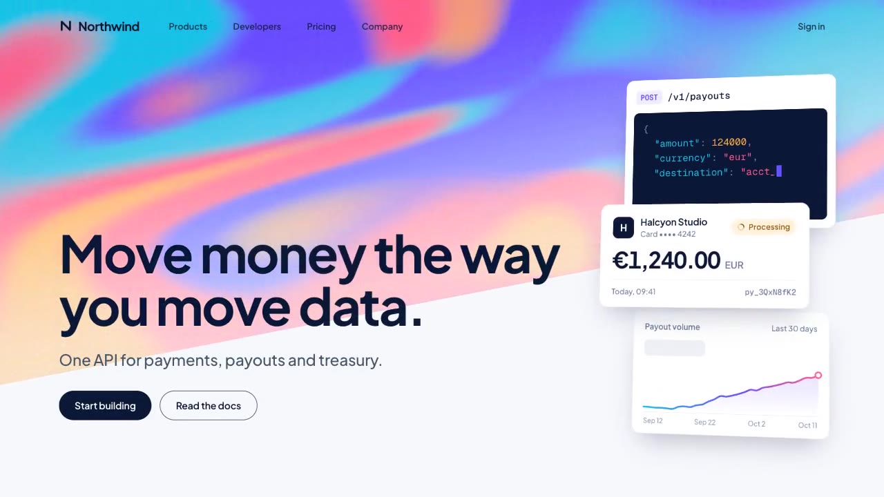
A slow, ribbon-like gradient mesh flows in a skewed band behind sharp headline type, while white payment, API and chart…
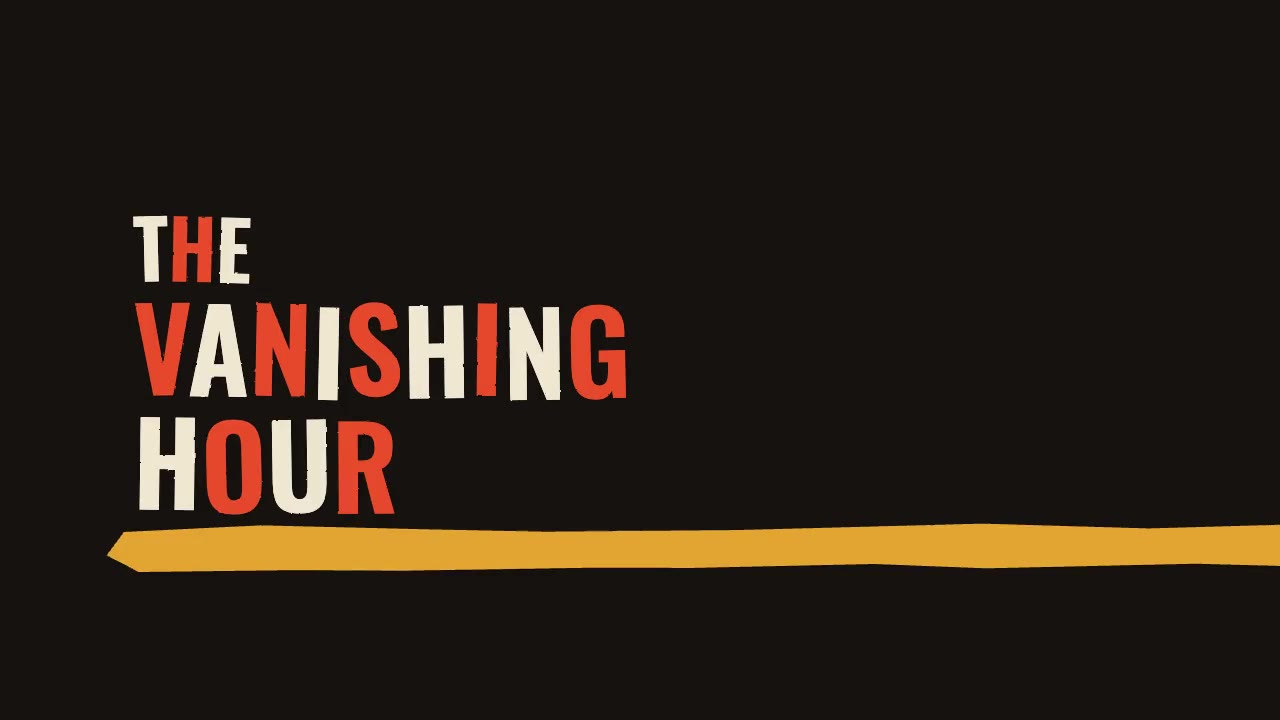
A jazz-tempo film title sequence in flat vermilion, mustard, bone and black: hand-cut paper shards jab in on the beat,…
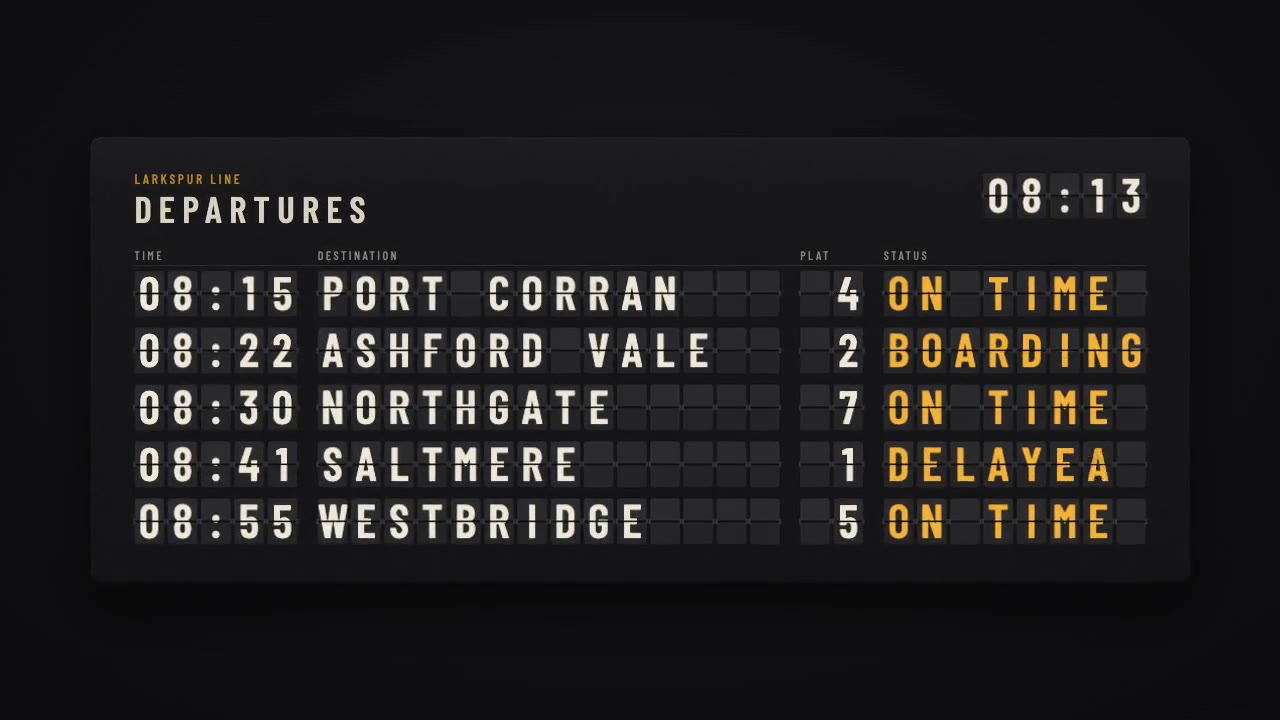
A mechanical station departure board where every flap steps through its drum to land on times, destinations and statuse…
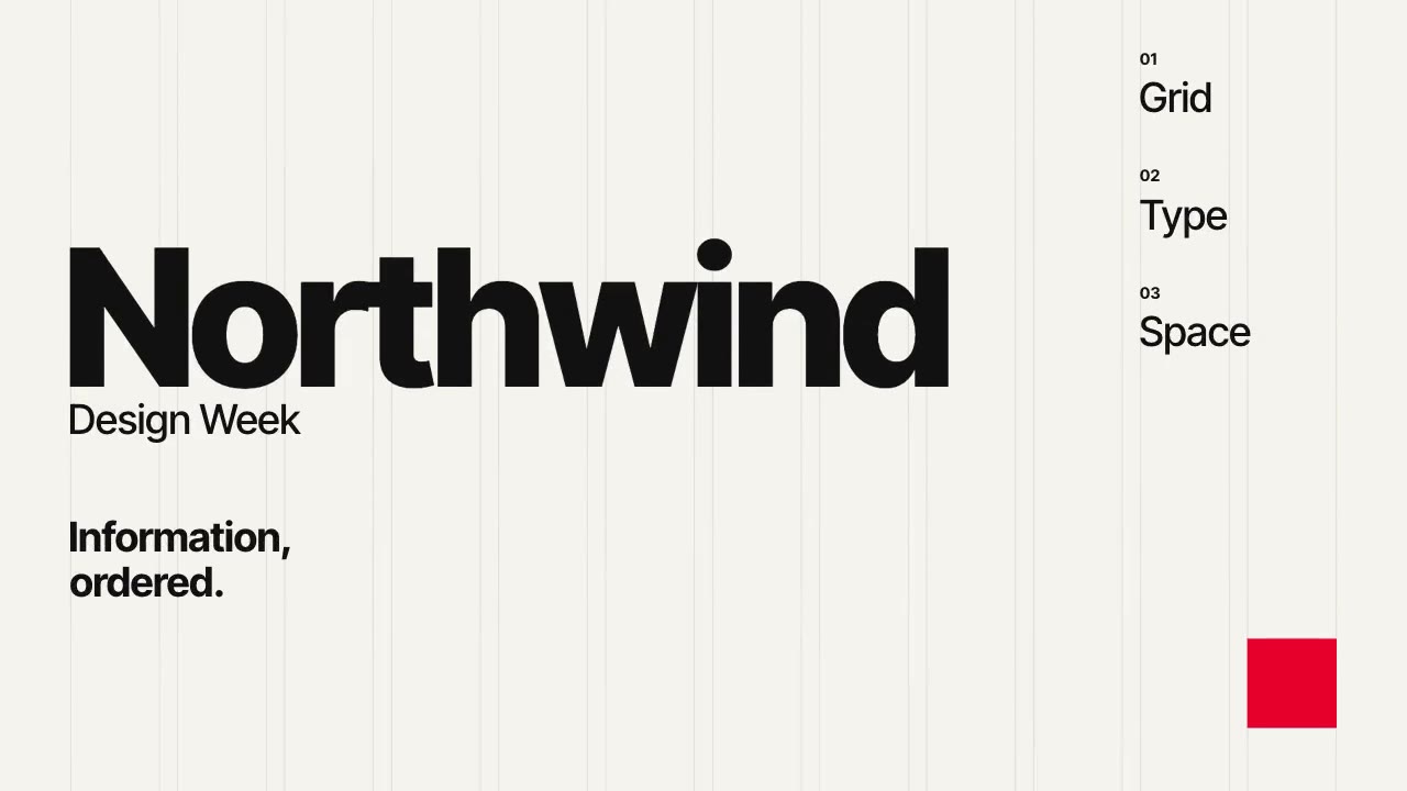
A Swiss-style event poster that builds itself on a visible 12-column grid: grotesque type rises out of baseline masks,…
More like this on the motion design inspiration board: Kinetic typography inspirationLine art animation inspiration