
Typewriter Documentary Title
A macro documentary opening on a manual typewriter: chrome typebars strike through a two-color ribbon, the carriage steps one letter at a time, a date line and an underlined title type out in cloth-textured ink, a red credit follows and a violet archive stamp lands.
Written and rendered by AI CSS Animations Oct 18, 2026
- Type
- prompt
- Made with
- Claude Opus 5.5 in Claude Code
- Built in
- Canvas
- Topics
- Kinetic type
About this style
The first commercially successful typewriter, the Sholes and Glidden, went on sale in 1874, built by E. Remington and Sons. A manual machine prints by swinging a typebar against an inked cloth ribbon and the paper on a rubber platen, and the carriage moves one fixed width per keystroke, so typed text is monospaced and the force of every strike shows in the ink. Small faults in each machine's type made it identifiable, which let document examiners match a typed page to the machine that produced it. Documentaries and true-crime series borrow typed titles, dates and stamped files to signal archive and evidence.
The prompt
Make a 10-second documentary opening shot in macro on a manual typewriter: typebars strike the sheet letter by letter, the carriage steps along, and a date line, a title and a stamp appear.

<inputs>
If I don't give you something, use the default and don't ask.
- Date line: PELLMOUTH, 9 MARCH 1957 (a fictional town).
- Title: THE HARBOUR LETTERS
- Credit, typed in red: a film by Nora Quill
- Stamp: ARCHIVE COPY · No. 0417
- Length: 10 seconds.
</inputs>

<direction>
- Palette: paper #F1E9D8 under a warm desk lamp (#FFF1D6 light from the upper left, falling to #D8CBB2 toward the right and bottom); black ribbon ink #1D1B1A; red ribbon ink #B02A22; stamp ink violet #5A3F8C; machine enamel #1C1A18 with soft highlights #4A4640; chrome #C9C6BF with dark reflections #3B3A37; platen rubber #121212.
- The machine, drawn in code with gradient shading: the sheet rises from behind a black rubber platen, a cylinder across the frame with one soft highlight band; in front of the printing point, a chrome card guide and the ribbon vibrator, which lifts a 26px cloth ribbon (black upper half, red lower half, fine woven texture) over the printing point at each strike; above the typing line, the paper bail, a chrome rod with two small rubber rollers resting on the sheet; across the bottom of the frame, the dark enamel body and the curved type guide.
- Typing: "Cutive Mono" 400, sized so its fixed advance is exactly 44px at the starting scale; single line spacing is 73px (six lines to the inch against ten characters), and double spacing 146px. The printing point stays fixed at screen x 1160 on the typing line at y 600: the sheet and carriage move, never the camera. Each keystroke: the typebar's chrome slug swings up from below into the printing point (40ms), the vibrator lifts the ribbon, the letter prints on contact, both drop back (60ms), and the carriage steps exactly one advance left in 30ms with a 1px settle. Spaces step without a strike. Keystroke intervals are seeded between 55 and 115ms with a small pause before each capital, so the rhythm is human. A carriage return slides the sheet right to the margin in 0.3s on cubic-bezier(0.3, 0, 0.2, 1) with a 2px bump at the stop, and each line feed is a ratchet click of 0.08s.
- Ink is the heart of it: render each glyph on an offscreen canvas at 3×, then print it through a ribbon-weave mask (a fine crosshatch noise at a 3px pitch), so strokes show cloth texture and a slight spread into the paper fibers. Every strike has its own seeded density (62–100%; the title strikes heavier, 85–100%), and heavy strikes partly fill the counters of e, a and o. The machine has a fingerprint: each character always sits at its own seeded offset (±1.5px vertically, ±0.6° rotation; the e rides 1px high, the capital A leans right), so repeated letters match.
- Underlining is real: after the title, the typist pushes the carriage back to the title's first letter and types an underscore under each of its 19 positions.
- Paper: fine fibers and a faint cockle (low-frequency shading at 3%), generated once at load; the sheet's left edge shows beyond the margin.
- Camera: macro with shallow depth of field: the typing line sharp, the paper blurring toward the top and the machine blurring toward the bottom (draw those bands from blurred offscreen copies). One pull-back, scaling about the printing point from 1.0 to 0.72.
- Stamp: a rubber-stamp impression, 560×128 at the final scale, a double-ruled rectangle with ARCHIVE COPY · No. 0417 in "Sofia Sans Extra Condensed" 800, 52px, uppercase, tracked 0.06em, rotated −6°, centered at (1480, 250) above and right of the typed block, clear of the date line; uneven ink with seeded voids and a heavier lower-left edge where it was pressed harder.
- Premium: a real machine's rhythm, carriage steps, cloth-textured ink that varies strike by strike, a typist's real underline. Cheap: a typewriter font revealed one letter at a time on a flat beige background, a smoothly gliding carriage, a sound waveform.
Banned: distressed or grunge typewriter fonts, letters fading in, a smoothly gliding carriage, coffee stains, burnt edges, photo paper textures, blinking cursors, motion blur, glow, camera shake, bright flashes at the strikes, anything flashing more than 3 times per second.
</direction>

<structure>
- 0.0–0.6s: macro on the blank typing line under lamp light; the ribbon at rest, the bail rollers on the sheet.
- 0.6–2.4s: PELLMOUTH, 9 MARCH 1957 types, 23 keystrokes.
- 2.4–2.8s: carriage return and two line feeds.
- 2.8–4.4s: THE HARBOUR LETTERS types, struck harder.
- 4.4–4.7s: the carriage is pushed back to the title's first letter.
- 4.7–5.5s: 19 underscores at 42ms each form a crisp rule under the title.
- 5.5–5.9s: carriage return and two line feeds while the camera pulls back to 0.72 (cubic-bezier(0.45, 0, 0.2, 1)) and settles: the date line and the underlined title read together.
- 5.9–7.3s: the vibrator shifts to the red half of the ribbon and "a film by Nora Quill" types in red.
- 7.3–7.6s: the stamp comes down: a soft shadow grows over the upper right for 0.15s, and the violet impression is there as it lifts.
- 7.6–10.0s: hold, nothing moving.
For other lengths, keep the typing rhythm and change the hold; keep at least 1 s of hold.
</structure>

<build>
- One self-contained index.html (inline CSS and JS), a 1920×1080 (16:9) stage scaled to fit the window, designed for 60fps. No image, video, texture or model files: every shape and texture is generated in code.
- window.seek(t), t in seconds, computes every visual from t alone: no CSS transitions or CSS animations, no setTimeout/setInterval, no state carried between frames, randomness only from a seeded PRNG. Anything cumulative is solved analytically from t or precomputed once at load at a fixed step. Past the end, seek clamps to the last frame.
- Without ?render in the URL, drive seek from requestAnimationFrame so it plays in a browser (loop after a 1s end hold); with ?render, don't start that loop.
- Google Fonts via <link> are fine; await document.fonts.load() for each face before defining window.seek.
- Engine: Canvas 2D, repainting every frame from scratch, the backing store sized from CSS size × devicePixelRatio. Canvas won't fetch fonts itself, so the awaited loads matter. No libraries.
- Precompute the keystroke schedule once at load (time, character, color, density, position on the sheet); seek(t) prints every glyph whose strike time has passed onto the sheet at its fixed position, and derives the carriage offset, line feed and slug position from the schedule at t.
</build>

<check>
Before showing me, step through one frame per second (t = 0…10): screenshot each and look at it. Fix overlaps, clipped or cramped text, and anything off-style or Banned. Check every keystroke moves the carriage exactly one advance, repeated letters share their offsets, the underscores sit under all 19 title positions, the ink shows weave texture at 1280×720, the 6 s frame shows the date line and underlined title sharp, and the date line, title, credit and stamp all read in the final frame. Confirm seek(10) and seek(11) match, so the final frame holds.
</check>
Ours, and free to use under CC0: copy it, change it, ship it. No credit needed.
Similar prompts
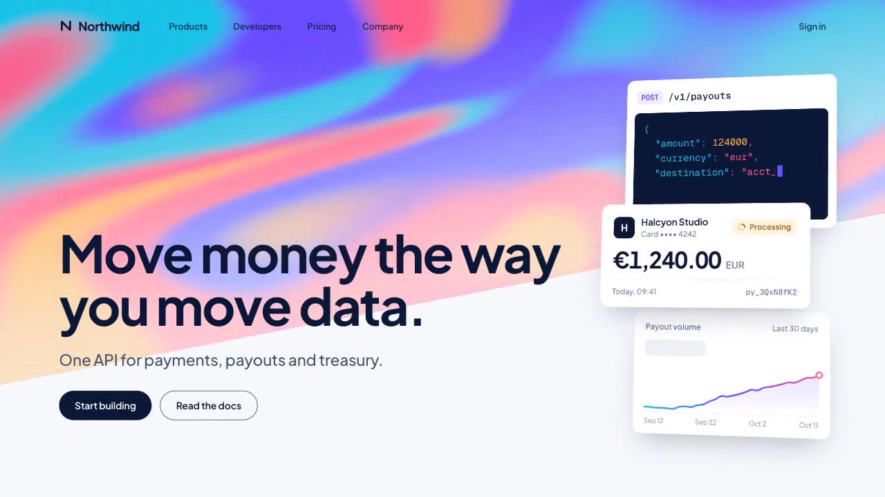
A slow, ribbon-like gradient mesh flows in a skewed band behind sharp headline type, while white payment, API and chart…
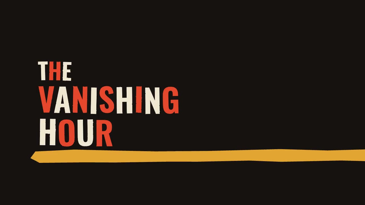
A jazz-tempo film title sequence in flat vermilion, mustard, bone and black: hand-cut paper shards jab in on the beat,…
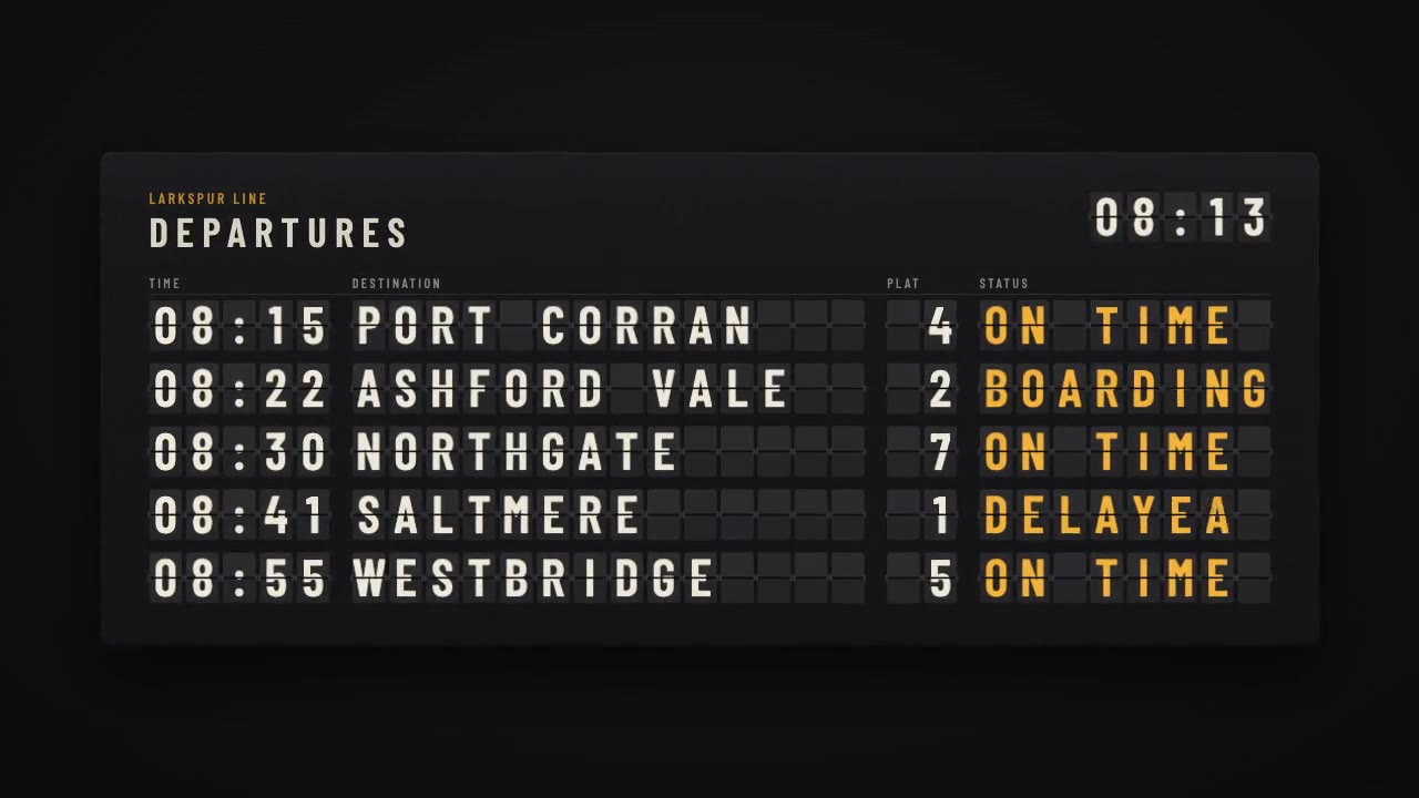
A mechanical station departure board where every flap steps through its drum to land on times, destinations and statuse…
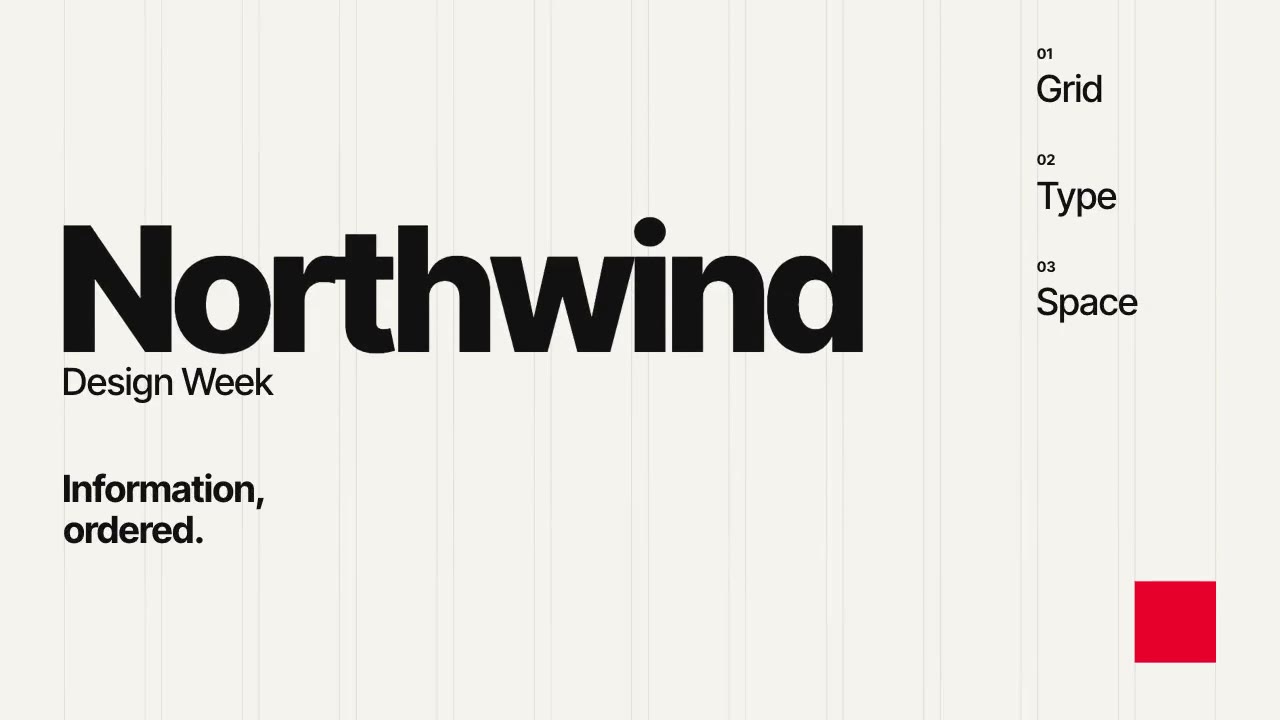
A Swiss-style event poster that builds itself on a visible 12-column grid: grotesque type rises out of baseline masks,…
More like this on the motion design inspiration board: Kinetic typography inspiration