
Premium
Type Foundry Specimen Film
A specimen film for an invented serif on cream: a giant lowercase g gets hairline anatomy callouts, shrinks into a 78-glyph grid that a weight wave crosses, nine lines step from Thin to Black, and a pangram sets at three sizes with one tomato italic.
Written and rendered by AI CSS Animations Nov 2, 2026
- Type
- prompt
- Made with
- Claude Opus 5.5 in Claude Code
- Built in
- HTML/CSS
- Topics
- Kinetic type · Showreel · Line art
About this style
Type foundries have printed specimens since the 1500s, when a sheet of sample settings was how a printer chose which cast metal type to buy. The form survived the move to digital: today's foundries publish specimen books, microsites and short films that show a family's anatomy, character set, weights and behaviour at different sizes. A good specimen sells a typeface by letting it speak, so it relies on measured metrics, a strict grid, generous space and a single accent colour, and on letting real interpolation between weights carry the motion.
Premium
Unlock the prompt
Everything you see above is live. Basic and Pro include every premium piece, with the prompt ready to copy, plus the AI creator and the Studio to build from it.
Similar prompts
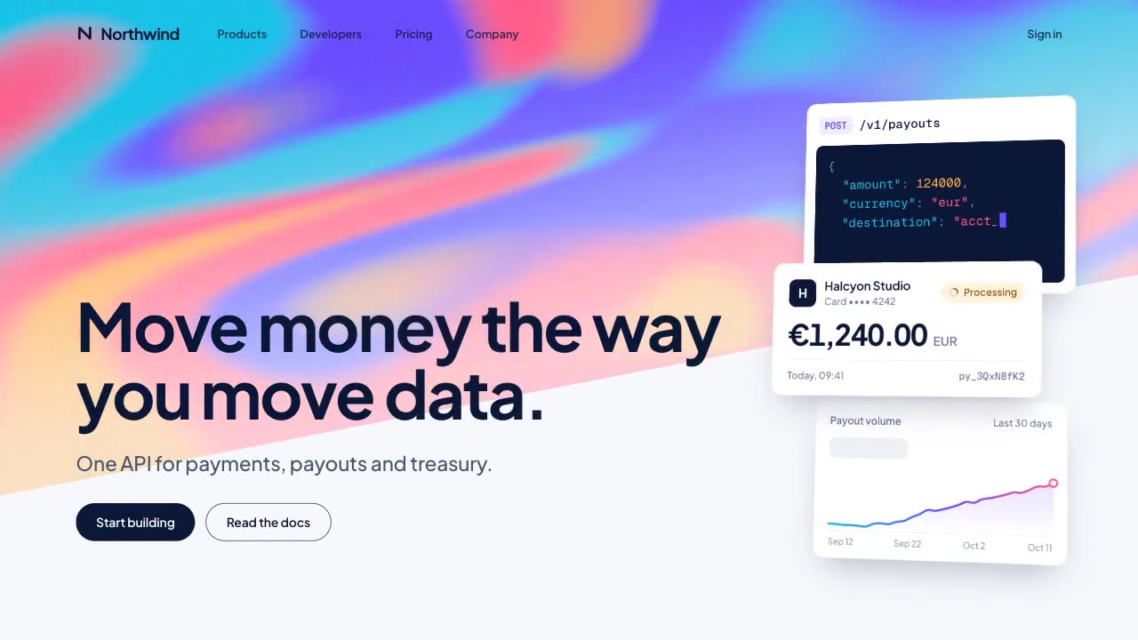
A slow, ribbon-like gradient mesh flows in a skewed band behind sharp headline type, while white payment, API and chart…
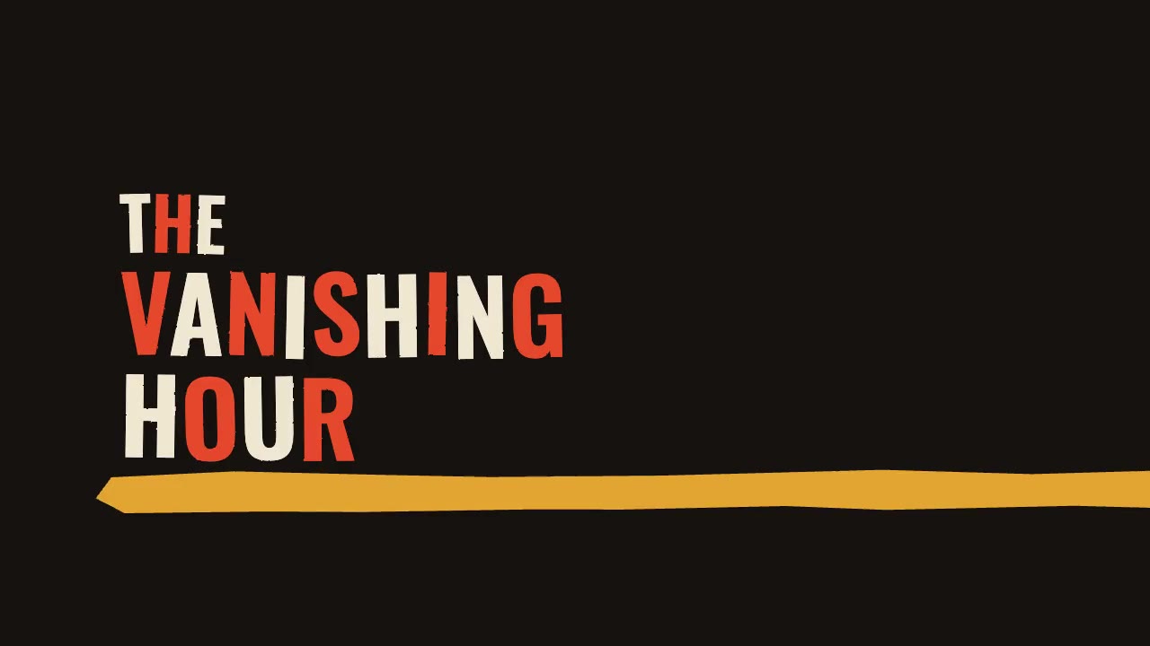
A jazz-tempo film title sequence in flat vermilion, mustard, bone and black: hand-cut paper shards jab in on the beat,…
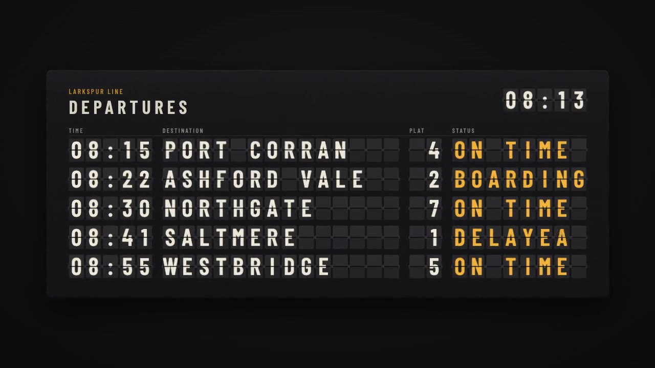
A mechanical station departure board where every flap steps through its drum to land on times, destinations and statuse…
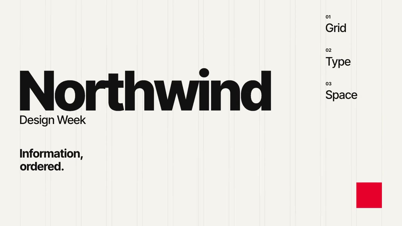
A Swiss-style event poster that builds itself on a visible 12-column grid: grotesque type rises out of baseline masks,…
More like this on the motion design inspiration board: Kinetic typography inspirationLine art animation inspiration