
New Wave Typography
A 1980s Swiss New Wave lecture poster layers itself on warm grey stock: a yellow line-screen field and a cyan dot screen overprint into green, stepped letters drop in, a coarse halftone sphere and stepped bars lock in, and the films slide once into a denser final arrangement.
Written and rendered by AI CSS Animations Oct 18, 2026
- Type
- prompt
- Made with
- Claude Opus 5.5 in Claude Code
- Built in
- HTML/CSS
- Topics
- Kinetic type · Shapes
About this style
Swiss New Wave grew out of Basel in the late 1960s and 1970s, when Wolfgang Weingart, teaching typography at the Basel School of Design, began breaking the rules of the International Typographic Style he had trained in. His posters stepped and letterspaced type, mixed weights inside a word and layered film positives, line screens and enlarged halftone dots into dense, textured compositions that were still built on a grid. Students who passed through Basel carried the approach to the United States, where it fed the layered, experimental graphic design of the 1980s. Designers still borrow it for event posters, music packaging and editorial work that wants complexity with control.
The prompt
Make a 10-second Swiss New Wave poster from the early 1980s that builds itself in layers, like film positives slid into place on a light table.

<inputs>
If I don't give you something, use the default and don't ask.
- School: Halden School of Design (fictional).
- Title: TEXTURE
- Subtitle: "Six evening lectures on type, screen and layer"
- Lectures (date, topic): 06.10 Screen · 13.10 Line · 20.10 Step · 27.10 Layer · 03.11 Space · 10.11 Noise
- Details: Thursdays · 19.00 · Lecture Hall 2
- Length: 10 seconds.
</inputs>

<direction>
- Palette: warm grey stock #E6E2D8, black #141414, process yellow #FFDA00, process cyan #00A0D8. Inks overprint like film: the yellow and cyan layers use mix-blend-mode: multiply, so where they cross they print green, and black prints over everything. No other colors, and no gradients except the stepped screens below.
- Type: one family, "Instrument Sans", using its wdth (75–100) and wght (400–700) axes. Title 210px; subtitle 36px at wght 500; small type 22–24px, often uppercase and tracked 0.3em. New Wave rules for type: mix weights and widths inside one word, step baselines, open tracking wide, run one line vertically, reverse one word out of a black bar.
- Grid: left margin 160px, right margin 120px, 8 columns of 184px with 24px gutters (column left edges at x 160, 368, 576, 784, 992, 1200, 1408, 1616). Every block's left edge sits on a column edge; only the vertical line and the registration crosses live in the margins. The grid is shown as guides at the start and is gone by the final frame, but you can still feel it.
- Layers, final positions:
  - Yellow field: x 160–968, y 112–640, carrying a horizontal line screen in four stepped bands across its lower half (1.5px black lines at a 6px pitch, at 6%, 12%, 18% and 24% opacity).
  - Cyan dot field: x 784–1384, y 300–840, dots on a 12px grid growing from 2px at its top-left to 10px at its bottom-right, so it prints green across the yellow field's lower right.
  - Halftone sphere: a 392×392 window at x 1408–1800, y 112–504, framed by a 1px black rule, holding a coarse halftone (16px pitch, black dots) of a shaded sphere lit from the upper left, like an enlarged screened photograph.
  - TEXTURE: from x 160, each letter's baseline 20px lower than the last (the T on y 520, the final E on y 640), letters alternating wght 700 at wdth 75 and wght 400 at wdth 100, tracking 0.14em in the final frame.
  - Stepped bars: three black bars 24px tall from x 160, ending at column edges x 760, 552 and 344, at y 720, 760 and 800.
  - LECTURES, 24px, wght 700, tracked 0.3em, reversed out in stock on a black bar at x 1408–1720, y 540–584.
  - Lecture list: from x 1408, six lines at 40px leading from baseline y 640, each indented 28px more than the line above (a staircase); dates in wght 700, topics in wght 400, 24px.
  - Vertical line: HALDEN SCHOOL OF DESIGN · AUTUMN TERM, 22px, uppercase, tracked 0.3em, rotated −90°, reading upward along x 112 from y 968.
  - Bottom block: a 4px black rule from x 160 to 968 at y 868 ending in a 16px black square; the subtitle on baseline y 924; the details, 24px, on baseline y 968.
  - Hatching: a band of 45° lines (3px black at a 10px pitch) at x 992–1592, y 944–1000.
  - A 2px black stepped hairline from the right end of the top bar (760, 732) to just left of the first lecture line (1396, 632), rising in four 25px steps at x 784, 992, 1200 and 1384.
  - Four registration crosses (24px, 1px black) at (96, 96), (1824, 96), (96, 984) and (1824, 984).
- Motion is assured and a little playful: layers slide in on straight paths on cubic-bezier(0.16, 1, 0.3, 1) over 0.5–0.7s and stop dead; big letters drop into place in three discrete 20px steps, 60ms apart, never a smooth fall; small lines rise 12px out of masks at their baselines; screens build band by band. One re-layering beat moves several layers at once on cubic-bezier(0.65, 0, 0.35, 1) over 0.8s. Edges stay razor sharp in every frame.
- Premium: layered screens and stepped type that look deliberately complex, yet every edge lands on the grid and the inks overprint for real. Cheap: random rotated words, a grunge texture and a gradient.
Banned: grunge or distressed fonts, drop shadows, glow, blur, soft gradients, 3D, rounded corners, script type, centered layouts, inks beyond black, yellow and cyan (green appears only as their overprint), any guide line in the final frame, anything flashing more than 3 times per second.
</direction>

<structure>
- 0.0–0.5s: bare stock; the registration crosses draw; 1px column guides at 15% black appear column by column, 30ms apart.
- 0.5–1.1s: the yellow field wipes down from its top edge (cubic-bezier(0.7, 0, 0.2, 1), 0.5s) at its first width, x 160–1176; its four line-screen bands print one after another, 80ms apart.
- 1.1–1.7s: the cyan dot field slides in from beyond the right edge to its first position, x 992–1592, y 160–700, printing green where it crosses the yellow.
- 1.7–2.7s: TEXTURE drops in letter by letter, 110ms apart, each in its three steps onto its stepped baseline, tracked at 0.04em.
- 2.7–3.5s: the stepped bars extend from the left, longest first, 120ms apart; the sphere's frame draws and its dots grow from nothing to full size in a sweep from top-left to bottom-right.
- 3.5–4.3s: the LECTURES bar slides in from the right; the lecture lines rise out of their masks down the staircase, 90ms apart.
- 4.3–5.1s: the re-layering beat, all at once: the cyan field slides to its final place so its green moves under the end of the title; the yellow field's right edge pulls in to x 968; the title's tracking opens to 0.14em, every letter stepping right; the guides fade out.
- 5.1–5.8s: the bottom rule draws left to right and its square stamps on; the subtitle and details rise out of their masks; the vertical line rises along the margin; the hatching band wipes in from the left.
- 5.8–6.6s: stillness: the poster reads complete.
- 6.6–7.2s: the stepped hairline draws from the bars to the lecture list, one step at a time.
- 7.2–10.0s: hold, nothing moving.
For other lengths, scale every timestamp proportionally.
</structure>

<build>
- One self-contained index.html (inline CSS and JS), a 1920×1080 (16:9) stage scaled to fit the window, designed for 60fps. No image, video, texture or model files: every shape and texture is generated in code.
- window.seek(t), t in seconds, computes every visual from t alone: no CSS transitions or CSS animations, no setTimeout/setInterval, no state carried between frames, randomness only from a seeded PRNG. Anything cumulative is solved analytically from t or precomputed once at load at a fixed step. Past the end, seek clamps to the last frame.
- Without ?render in the URL, drive seek from requestAnimationFrame so it plays in a browser (loop after a 1s end hold); with ?render, don't start that loop.
- Google Fonts via <link> are fine; await document.fonts.load() for each face before defining window.seek.
- Engine: HTML/CSS, no libraries (no three.js: this style is flat). Absolutely positioned elements, with transforms, clip-paths and opacity set from seek; the yellow and cyan layers use mix-blend-mode: multiply. Draw the dot field, the halftone sphere and the hatching into canvases or inline SVG once at load. Request the Instrument Sans wdth and wght axis ranges in the css2 URL and set them per letter with font-variation-settings.
</build>

<check>
Before showing me, step through one frame per second (t = 0…10): screenshot each and look at it. Fix overlaps, clipped or cramped text, and anything off-style or Banned. Overlay the column grid on the 6 s and final frames: every block's left edge must sit on a column edge. Check yellow over cyan prints green, TEXTURE still reads as one word across its steps, the lecture list sits on bare stock, and no guide survives into the final frame. Confirm seek(10) and seek(11) match, so the final frame holds.
</check>
Ours, and free to use under CC0: copy it, change it, ship it. No credit needed.
Similar prompts
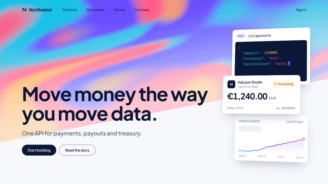
A slow, ribbon-like gradient mesh flows in a skewed band behind sharp headline type, while white payment, API and chart…
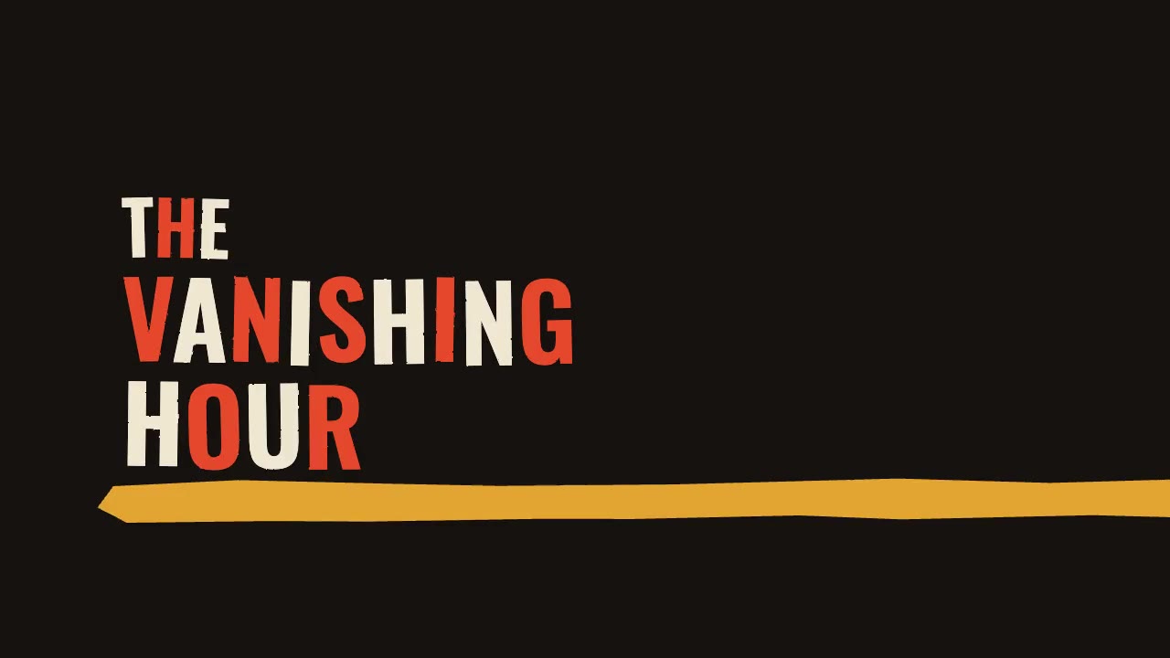
A jazz-tempo film title sequence in flat vermilion, mustard, bone and black: hand-cut paper shards jab in on the beat,…
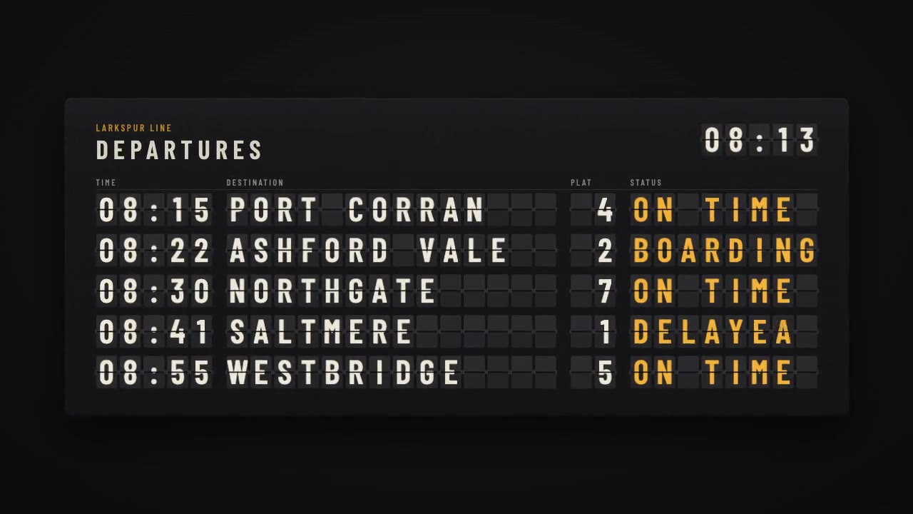
A mechanical station departure board where every flap steps through its drum to land on times, destinations and statuse…
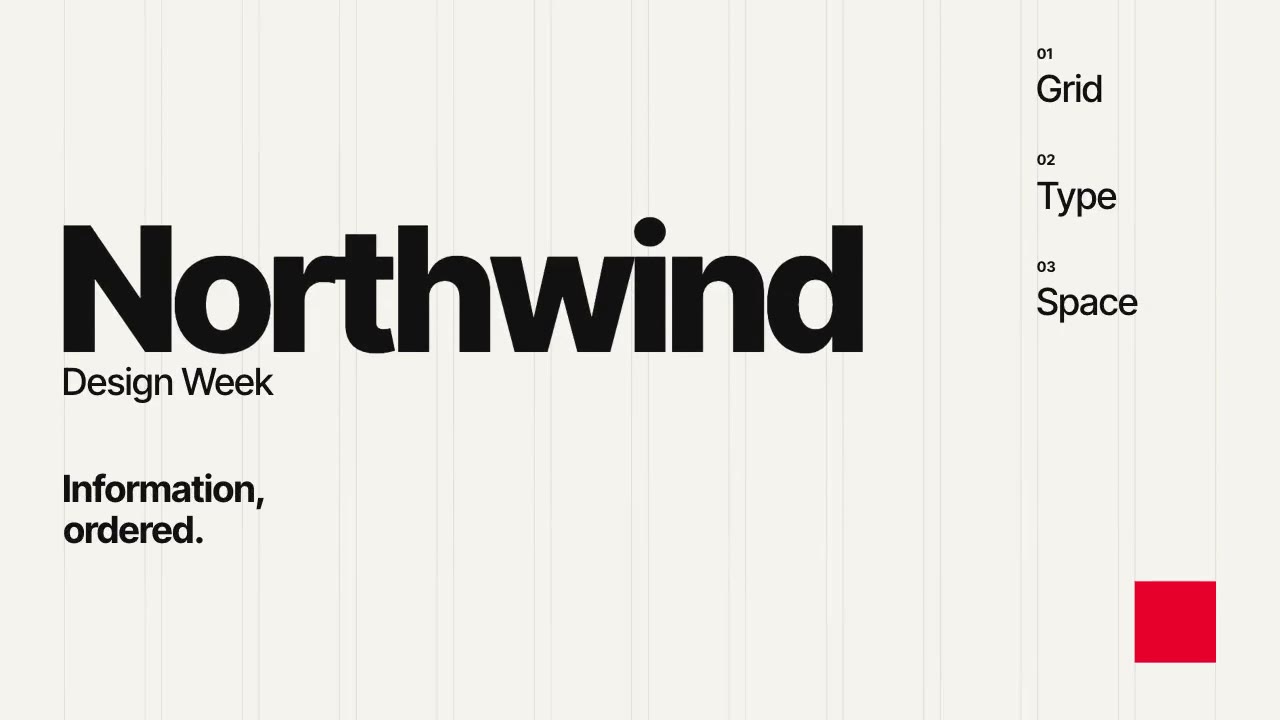
A Swiss-style event poster that builds itself on a visible 12-column grid: grotesque type rises out of baseline masks,…
More like this on the motion design inspiration board: Kinetic typography inspirationMotion graphics inspiration