
Manga Action Panel
A black-and-white manga page read right to left: rooftops, narrowed eyes, a silhouetted courier leaping through focus lines and a crouched landing slam in panel by panel, with screentone skies and huge katakana sound effects breaking the borders.
Written and rendered by AI CSS Animations Oct 16, 2026
- Type
- prompt
- Made with
- Claude Opus 5.5 in Claude Code
- Built in
- SVG
- Topics
- Kinetic type · Characters
About this style
Manga are Japanese comics, usually printed in black and white and read right to left, starting from the top-right panel. Artists ink with dip pens and brushes and add gray only through screentone, sheets of printed dot patterns cut and pressed onto the page, now mostly applied digitally. Action pages rely on speed lines, focus lines that converge on a subject, and large hand-lettered sound effects that cross panel borders. That vocabulary now runs through anime openings, music videos, games and advertising worldwide.
The prompt
Make a 10-second black-and-white manga action page that builds panel by panel.

<inputs>
Series: TWELVE FLOORS UP. Chapter line: "Chapter 12 · The Gap". Caption: "Last drop of the night. One roof to go." Speech: "Two minutes early." Sound effects: ゴゴゴ (menace, gloss "GOGOGO"), ドンッ (impact, gloss "DON"), ザッ (skid, gloss "ZAT"). Duration: 10s. If I don't give you something, use the default and don't ask.
</inputs>

<direction>
Palette: paper #F9F7F2 and ink #0B0B0B, nothing else. Every gray is screentone: black dots on a 45° grid, 6px pitch, radius set by tone (10%, 30%, 50%), or a ramp of dot sizes for a gradient. No gray fills, no opacity tricks.
Type: Dela Gothic One for the sound effects and series title; Patrick Hand, uppercase, 34px, line height 1.1, for speech; Zen Kaku Gothic New 700 at 26px for the caption and chapter line. Sound effects are huge (ドンッ at about 220px), black with an 8px paper-colored outline (paint-order: stroke), tilted 6–12°, and break across panel borders into the gutters; each has its English gloss in Patrick Hand 22px beside it, as translated manga do.
Page: read right to left, top-right panel first. 72px outer margin, 4px black borders, 14px gutters between panels in a tier, 26px between tiers.
Tier 1 (y 72–440). P1, x 760–1848: night rooftops in clean line art with water tanks and antennas, the sky toned dense at the top and ramping to bare paper at the horizon, a crisp paper-white moon, and the caption in a paper box with a 3px border in its top-right corner. P2, x 72–746: an extreme close-up of narrowed eyes under a sharp brow, irises toned 50% with two paper highlights, hair strands as tapered black wedges.
Tier 2 (y 466–1008), split by a gutter slanted 10°, running from x 830 at the top to x 734 at the bottom. P3, right: the courier mid-leap in solid black silhouette (hood, satchel, legs split, a long scarf in three jagged wedges), about 380px across and centered near (1060, 640), with a 4px paper rim line, inside 220 focus lines: tapered wedges converging on the figure that stop at a seeded, irregular ellipse around it. P4, left: the courier landing in a crouch, one hand down, horizontal speed lines, three dust puffs, and the balloon: a paper oval with a 3px border, a short pointed tail and at least 24px of padding.
Line work: every stroke tapers at both ends like a G-pen nib, 2–8px wide; draw strokes as filled shapes, not uniform strokes.
Motion is slam and hold. A panel arrives in 0.16s from scale 1.06 to 1.0 on cubic-bezier(0.2, 0.9, 0.2, 1), its contents 60ms later. Speed and focus lines shoot in from the panel edge over 0.2s with seeded 0–80ms offsets. Sound effects slam from scale 1.5 to 1.0 in 0.14s. An impact shakes the page 10px, decaying over 0.25s. Each panel then holds still for at least 1s.
The real thing is ink discipline: tapered lines, pure black and white, tone only from dots, sound effects that break the border. The cheap version is gray gradients, a comic font and a generic anime face.
Banned: color, gray fills, gradients, blur, glow, soft shadows, white impact flashes, weapons, existing manga characters or their costumes, emoji, flashing more than 3 times per second.
</direction>

<structure>
0.0–0.3s: blank paper.
0.3–1.5s: P1 slams in; the sky tone wipes down over 0.4s; the caption box drops into place at 0.8s.
1.5–2.9s: P2 slams in; from 1.9s ゴゴゴ stacks down its right edge one character every 90ms, crossing the border, with its gloss.
2.9–5.0s: P3: the focus lines shoot in, the figure slams in, and at 3.3s ドンッ hits across the top-right of the panel, spilling over the tier gutter onto P1's lower border, clear of the figure; the page shakes and punches in to 1.03, settling over 0.4s.
5.0–6.6s: P4 slams in; speed lines streak; the dust puffs pop; ザッ lands small near the hand; the balloon pops at 5.5s (scale 0.9 → 1 in 0.12s).
6.6–7.6s: hold for reading.
7.6–8.4s: the title plate slams onto P3's lower-right corner (x 1060–1820, y 830–990), clear of the figure: a black rectangle with TWELVE FLOORS UP in paper at 56px and the chapter line beneath; a 4px shake.
8.4–10.0s: hold, completely still.
For other durations, scale every timestamp proportionally and keep each panel's hold at least 1s.
</structure>

<build>
One self-contained index.html, CSS and JS inline. The stage is 1920×1080 (16:9), scaled to fit the window. Design for 60fps. window.seek(t), t in seconds, must compute every visual from t alone, clamping past the end to the last frame: no CSS transitions or animations, no setTimeout or setInterval, no state carried between frames, and randomness only from a seeded PRNG. Anything cumulative is precomputed once at load at a fixed step or solved analytically, so seek can jump to any time. Load Google Fonts via <link> and await document.fonts.load() for each face before defining window.seek. Without ?render in the URL, drive seek from requestAnimationFrame so it plays in a browser (loop after a 1s end hold); with ?render, don't start that loop.
Engine: inline SVG. Panels clip their art with clipPaths; screentone uses <pattern> dot grids, with ramps built from rows of individually sized circles; focus and speed lines are seeded polygons precomputed at load; seek sets transforms and attributes. Load the Japanese glyphs explicitly with document.fonts.load('400 300px "Dela Gothic One"', 'ゴドンッザ') so no character falls back.
</build>

<check>
Before showing me, step through one frame per second (0–10s): screenshot each and look at it. Fix overlaps, clipped or cramped text, accidental edge collisions, and anything off-style or Banned. Check that panels read right to left, no pixel is gray except dot tone, every sound effect is legible and crosses a border, the balloon text has padding, the focus lines never cover the figure, and no katakana renders as a fallback box. Confirm seek(10) and seek(11) match, so the final frame holds.
</check>
Ours, and free to use under CC0: copy it, change it, ship it. No credit needed.
Similar prompts
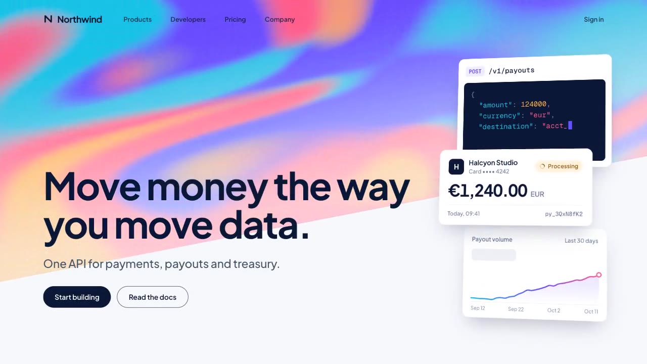
A slow, ribbon-like gradient mesh flows in a skewed band behind sharp headline type, while white payment, API and chart…
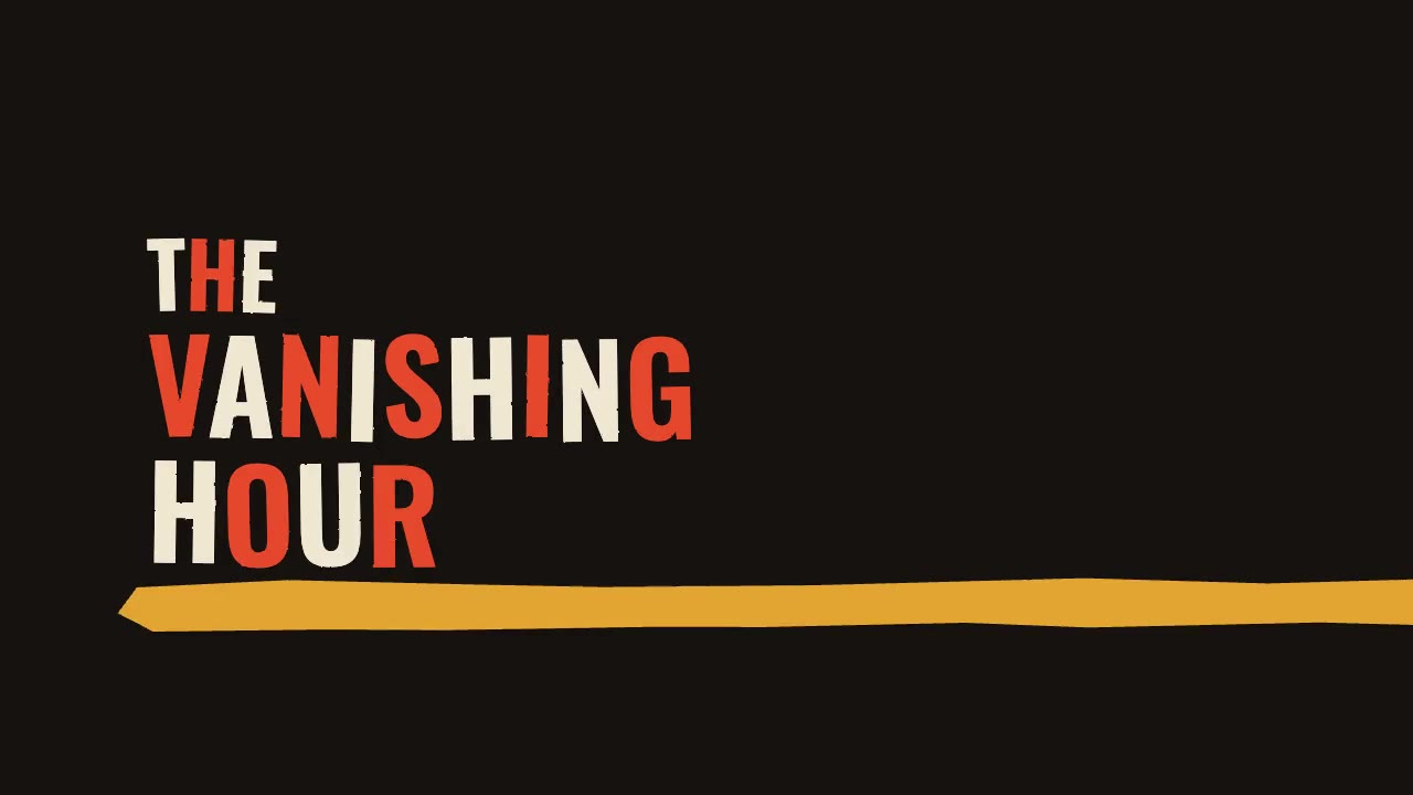
A jazz-tempo film title sequence in flat vermilion, mustard, bone and black: hand-cut paper shards jab in on the beat,…
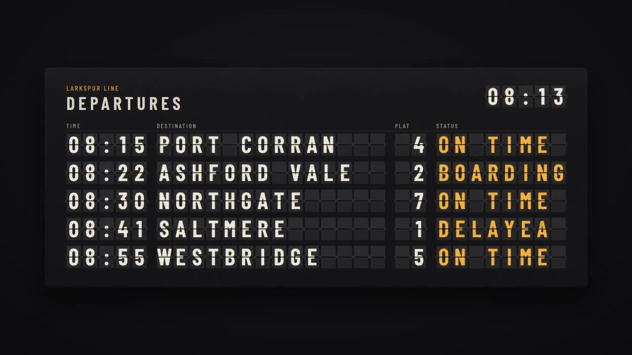
A mechanical station departure board where every flap steps through its drum to land on times, destinations and statuse…
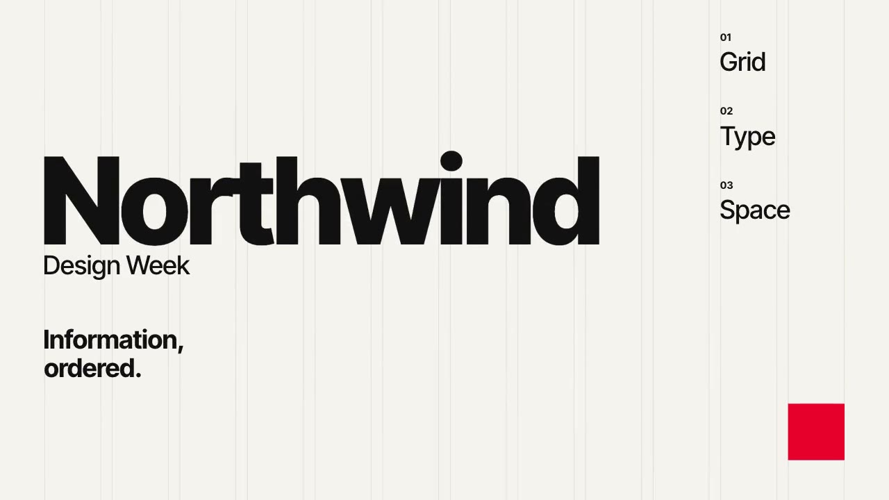
A Swiss-style event poster that builds itself on a visible 12-column grid: grotesque type rises out of baseline masks,…
More like this on the motion design inspiration board: Kinetic typography inspirationCharacter animation inspiration