
90s Grunge Typography
A 1990s music magazine spread on photocopy white: giant cropped grey type slams in through jump cuts, body columns overprint and double-feed across a broken grid, a halftone photo gets taped on, then everything gives way to one clean italic headline on a black slab.
Written and rendered by AI CSS Animations Oct 16, 2026
- Type
- prompt
- Made with
- Claude Opus 5.5 in Claude Code
- Built in
- HTML/CSS
- Topics
- Kinetic type
About this style
In the early 1990s, art directors at American music, surf and skate magazines broke the page grid on purpose: type over type, columns running off the page, letters cropped by the trim, and photocopied or scanned textures. Cheap desktop publishing, with software such as QuarkXPress and Photoshop, made that kind of layering quick to try. Ray Gun, a music magazine launched in 1992, became its best-known example. The look returns regularly in fashion, music and youth-brand campaigns.
The prompt
Make a 10-second 1990s experimental magazine spread that breaks its grid, then settles on one readable headline.

<inputs>
Magazine: STATIC FIELD. Issue: No. 14 · Spring. Headline: "Louder than the room". Deck: "Forty nights on the road with Velvet Dial, and the songs that survived them." Pull quote: "We tuned down until the walls hummed." Body copy: about 90 words of plain interview prose you write, in three short columns. Page numbers: 46 and 47. Duration: 10s. If I don't give you something, use the default and don't ask.
</inputs>

<direction>
Palette: copier white #ECEAE3 (never pure white), toner black #151515, second-generation grey #8C8983, and safety orange #FF5A1F on two elements only: an issue tab and one underline.
Type, a deliberate clash: "Anton" 400 for giant fragments (320–560px, cropped); "Bodoni Moda" 900 italic (opsz 96) for the headline, 150px, two lines; "Special Elite" 400 for the deck, 34px; "Courier Prime" 400 for body copy, 22px, leading 1.2, one column crushed to 0.9 so its lines collide; "Permanent Marker" 400 for scrawls, 44px. Tracking runs from −0.05em to 0.5em.
Spread: two pages meeting at x 960, a 60px soft gutter shadow, a ragged copier-lid shadow down the far left. Running head STATIC FIELD · No. 14 · Spring in Courier Prime 22px, tracked 0.5em, atop the right page.
Grid, then the break: 6 columns per page (120px, 24px gutters, 70px outer and 50px inner margins), broken on purpose: one body column rotated 90° up the left margin, one justified so rivers open, one printed twice 6px apart at 50% (a double feed), LOUDER so large only its middle shows, the page number 46 at 280px in grey, a black rule that stops short of its column. Overlaps are intended, but the headline ends on a clean field. Real copy stays 70px or more from the edges.
Photocopy texture: toner speckle (dots and clusters), two faint vertical streaks, edge darkening, and slightly rough type edges from an SVG feTurbulence + feDisplacementMap filter (scale 2, fixed seed). Four pre-rendered grain frames cycle at 8 per second at 7% opacity, so the page stays alive without flashing.
A copied photo, drawn in code: a 420×520 panel of coarse 12px halftone dots showing a microphone on a stand under a cone of stage light, held by two strips of translucent tape (#E6DFC4 at 55%).
Motion is restless, then it gives up: elements slam in on cubic-bezier(0.1, 0.9, 0.2, 1) over 0.2–0.3s; jump cuts move blocks, never less than 0.4s apart; a few blocks jitter 1–3px on 12-per-second steps like a misfeed; one body column scrolls up at 40px/s. All motion stops by 8.0s. The real thing is a grid broken on purpose, type used as image and copy you can still find; the cheap version is a distressed font and a scratched-film filter over a centered title.
Banned: distressed display fonts, scratched-film overlays, centered layouts, drop shadows, glow, gradients other than the shadows, lorem ipsum, full-frame flashes or inversions, cuts less than 0.4s apart, anything flashing more than 3 times per second.
</direction>

<structure>
0.0–0.5s: blank copier white; a soft grey scan bar sweeps left to right, leaving speckle, streaks and gutter.
0.5–1.7s: LOUDER (Anton, 560px, grey) slams onto the left page in three jump cuts 0.4s apart, each a new crop; 46 lands lower left, 47 small at lower right.
1.7–2.9s: the body columns slide up into their broken positions; the running head and orange issue tab land; the taped photo drops onto the right page.
2.9–4.0s: the deck types on at 60 characters per second with ±2px baseline jitter; the pull quote (Bodoni italic, 56px) sets across the gutter.
4.0–4.8s: jump cuts at 4.0s and 4.4s hop the photo and one column to new places.
4.8–5.8s: a black slab (880×380) slides over the left page and the headline sets onto it in copier white, word by word: the only text nothing overlaps.
5.8–6.6s: an orange marker underline scrawls under "room"; "turn it up →" scrawls in black by the photo.
6.6–8.0s: the jitter calms to zero and the scrolling column eases to a stop.
8.0–10.0s: hold.
For other durations, scale every timestamp proportionally, keeping cuts at least 0.4s apart.
</structure>

<build>
One self-contained index.html, CSS and JS inline. Google Fonts via <link> are fine; no other libraries (no three.js: this style is flat). Request the Bodoni Moda italic, opsz and weight axes. Use absolutely positioned elements, setting transforms, clip-paths and opacity from seek, with mix-blend-mode: multiply for overprints; draw the photo, speckle and grain frames into canvases once at load. Await document.fonts.load() for each face, then define window.seek. The stage is 1920×1080 (16:9), scaled to fit the window. Design for 60fps. window.seek(t), t in seconds, must compute every visual from t alone: no CSS transitions or animations, no setTimeout or setInterval, no state carried between frames, and randomness only from a seeded PRNG. Without ?render in the URL, drive seek from requestAnimationFrame so it plays in a browser (loop after a 1s end hold); with ?render, don't start that loop.
</build>

<check>
Before showing me, step through one frame per second: screenshot each and look at it. Fix overlaps, clipped or cramped text, accidental edge collisions, and anything off-style or Banned. Check the headline is fully readable on its slab in the final frame with nothing crossing it, body copy is real English at 22px, no cut follows another within 0.4s, and the grain never reads as flicker. Confirm seek(duration) and seek(duration + 1) match, so the final frame holds.
</check>
Ours, and free to use under CC0: copy it, change it, ship it. No credit needed.
Similar prompts
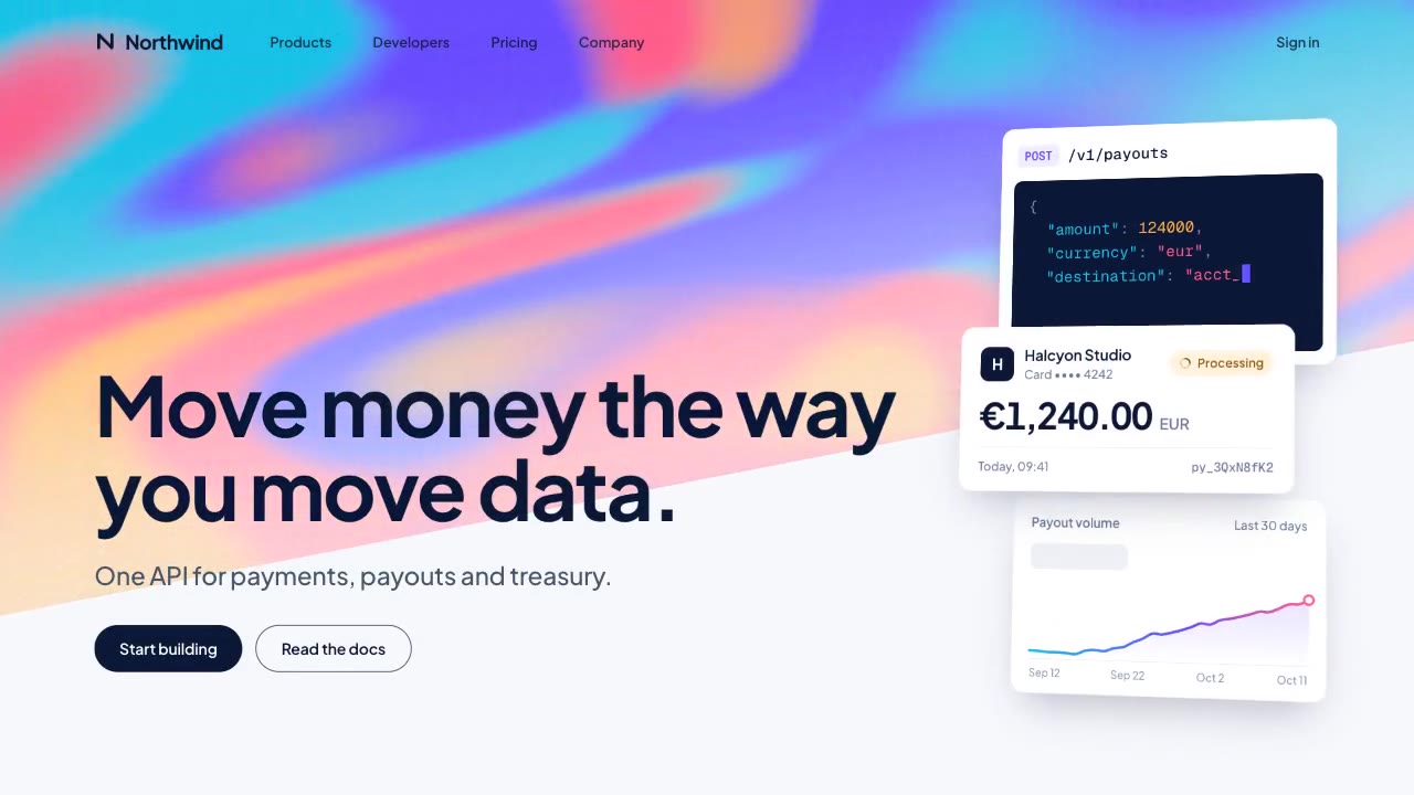
A slow, ribbon-like gradient mesh flows in a skewed band behind sharp headline type, while white payment, API and chart…
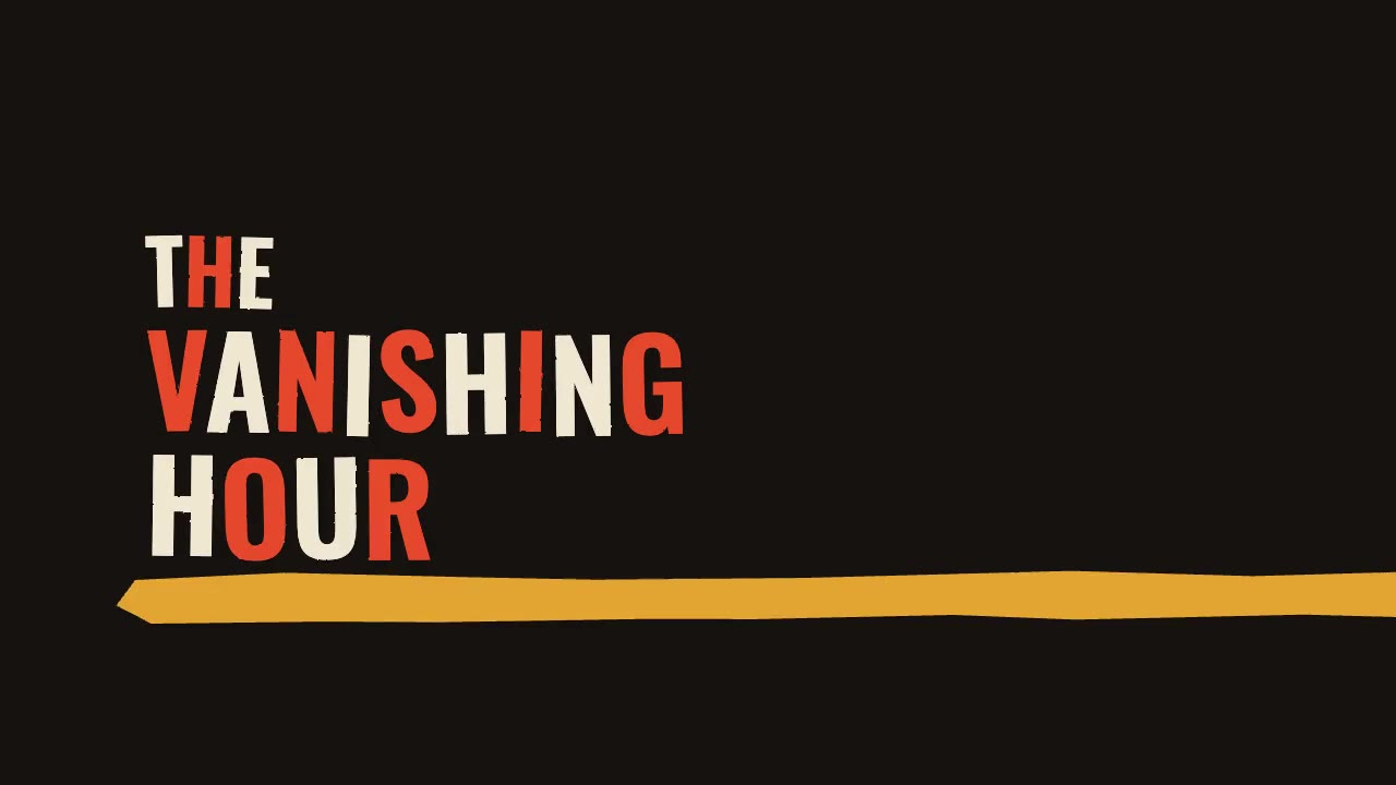
A jazz-tempo film title sequence in flat vermilion, mustard, bone and black: hand-cut paper shards jab in on the beat,…
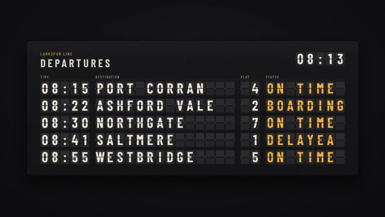
A mechanical station departure board where every flap steps through its drum to land on times, destinations and statuse…
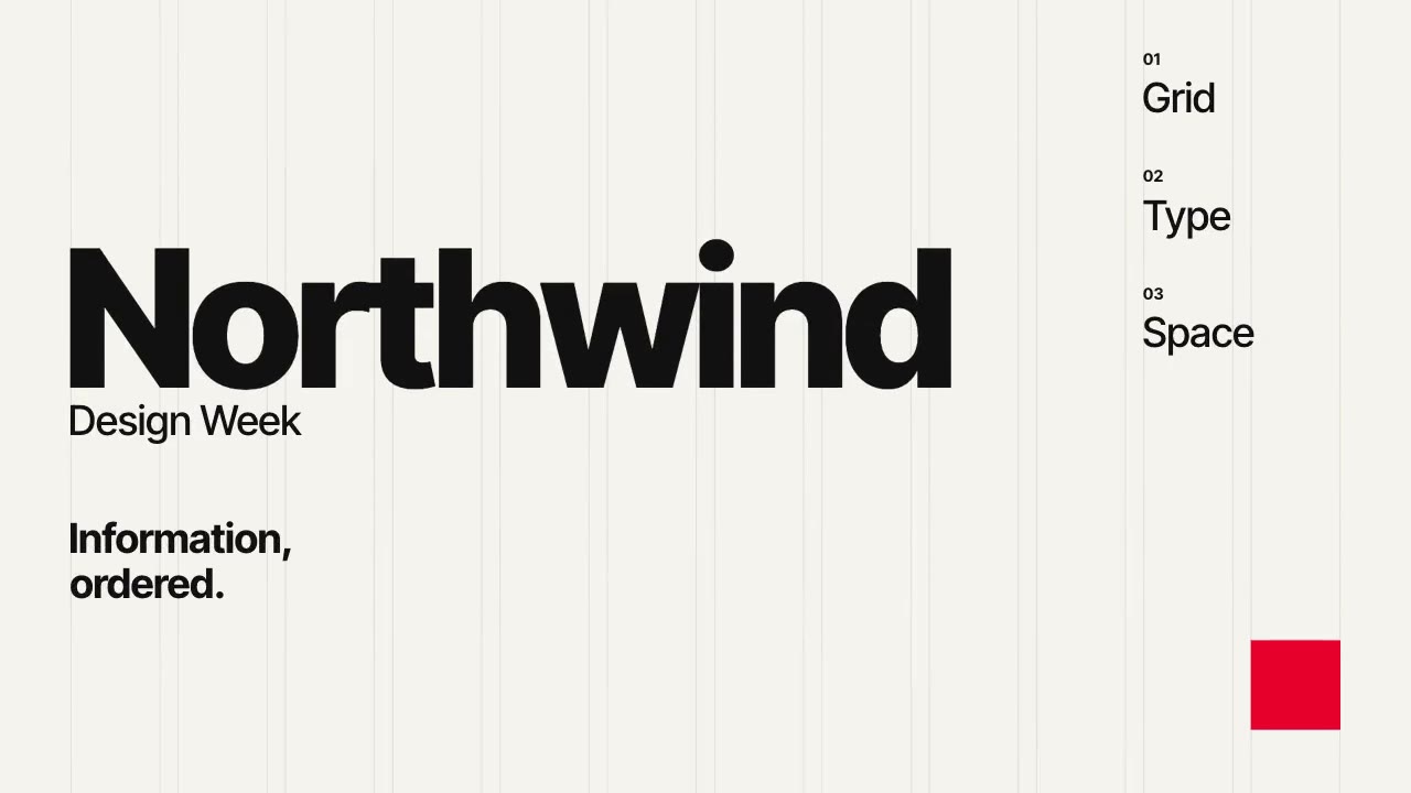
A Swiss-style event poster that builds itself on a visible 12-column grid: grotesque type rises out of baseline masks,…
More like this on the motion design inspiration board: Kinetic typography inspiration