
Editorial Serif Titles
The opening spread of a fashion monthly brought to life: a high-contrast Didone headline rising from slow masks, widely tracked labels, hairline rules and a tonal image panel on cream and ink.
Written and rendered by AI CSS Animations Oct 12, 2026
- Type
- prompt
- Made with
- Claude Opus 5.5 in Claude Code
- Built in
- HTML/CSS
- Topics
- Kinetic type
About this style
Didone typefaces, named for the Didot family in Paris and Giambattista Bodoni in Parma, date from the late eighteenth century and are defined by extreme contrast between hairlines and heavy stems. Fashion and luxury magazines have leaned on them for mastheads and headlines for generations, pairing them with wide margins and small tracked capitals. In motion the style works through restraint: few elements, a lot of air and slow, exact reveals that signal confidence and cost.
The prompt
<inputs>
If I don't give you something, use the default and don't ask.
- Magazine: default "ONDINE"
- Issue line: default "Issue Nº 14 — Autumn"
- Title, two lines: default "The Art" / "of Slowness" (italic "Slowness")
- Standfirst: default "Twelve designers on making less, and making it last."
- Folio: default "p. 48"
- Palette: default cream #F2ECE1, ink #1C1A17, oxblood #6B1E22
- Length: default 10 seconds
</inputs>

<direction>
A fashion monthly's feature opener, animated with the patience of a perfume film. Restraint is the brief: few elements, lots of air, slow exact motion.

Palette: cream ground, ink type, oxblood only for hairlines and the folio, warm grey #8C8376 for secondary labels.

Type: Bodoni Moda (Google Fonts, variable opsz 6–96, wght 400–900) for title and standfirst, opsz maxed at display sizes for razor hairlines. Title 160–200 px, weight 400–500, tracking -0.01em, leading 0.95; the italic word carries the voice. Jost 400 for labels: uppercase, 18–22 px, tracking 0.28–0.35em. Two typefaces only.

Layout: asymmetric, 160 px margins, 12 columns. Title flush-left across columns 1–8; on columns 10–12 a tall 4:5 panel of soft tonal field (two blurred warm-grey radial gradients plus grain) standing in for a photograph. Hairlines exactly 1 px.

Motion: each title line rises its full height from behind a mask at its baseline over 1.3–1.7 s, cubic-bezier(0.22, 1, 0.36, 1). Labels track in (0.6em → 0.3em) with opacity over 1.2 s. Rules draw at constant speed. The panel opens with a clip-path inset from its vertical center, then pushes 1.00 → 1.04 to the end. No move shorter than 0.6 s. The standfirst stays fully visible at least 3 s.

Authentic: optical sizing, true italics, rules aligned to type, motion like a slow breath. Cheap: centered layouts, faux bold.

Banned: Playfair Display, bounce or overshoot, motion blur, drop shadows, gradients on type, #FFFFFF or #000000, typewriter reveals, anything flashing more than 3 times per second.
</direction>

<structure>
Default 10 s:
- 0.0–0.8: cream and grain; an oxblood hairline draws from the left margin to 560 px.
- 0.6–2.0: issue line tracks in above the rule.
- 1.4–3.4: title line 1 rises from its mask; line 2 follows 0.3 s later.
- 3.2–4.4: the image panel opens from its center line.
- 4.4–6.0: standfirst fades up beneath in Bodoni Moda 400, 34 px, lines staggered 0.25 s.
- 6.4–7.6: masthead (Jost, top margin) and folio (bottom right) track in.
- 7.6–10.0: hold; only the image push and grain continue.

Other lengths: scale reveals, never below 1.0 s each; keep at least 2 s of final hold.
</structure>

<build>
- One self-contained index.html, no libraries (three.js from a CDN only when a style truly needs 3D); a 1920×1080 (16:9) stage scaled to fit the window; designed for 60fps.
- window.seek(t), t in seconds, computes every visual from t alone: no CSS transitions or animations, no setTimeout/setInterval, no state carried between frames. Grain comes from a seeded PRNG keyed to the frame.
- No ?render in the URL: drive seek from requestAnimationFrame so it plays in a browser. With ?render: don't start that loop.
- Google Fonts via <link>; await document.fonts.load() for each face before assigning window.seek.
- HTML/CSS: set transform, clip-path, opacity, letter-spacing and font-variation-settings in seek; draw grain on a small upscaled canvas.
</build>

<check>
Before showing me, step through one frame per second and look at each. Fix overlaps, clipped or cramped text and anything off-style. Check the last frame would work as a printed page. Confirm the final frame holds.
</check>
Ours, and free to use under CC0: copy it, change it, ship it. No credit needed.
Similar prompts
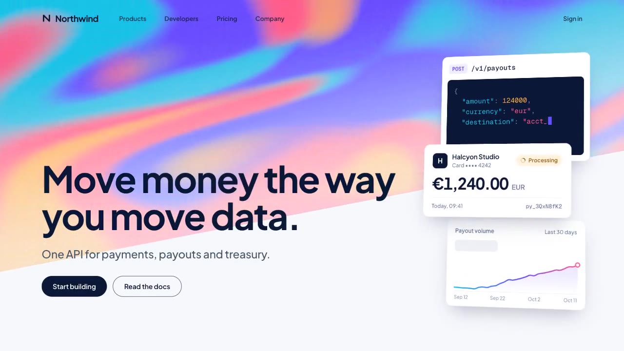
A slow, ribbon-like gradient mesh flows in a skewed band behind sharp headline type, while white payment, API and chart…
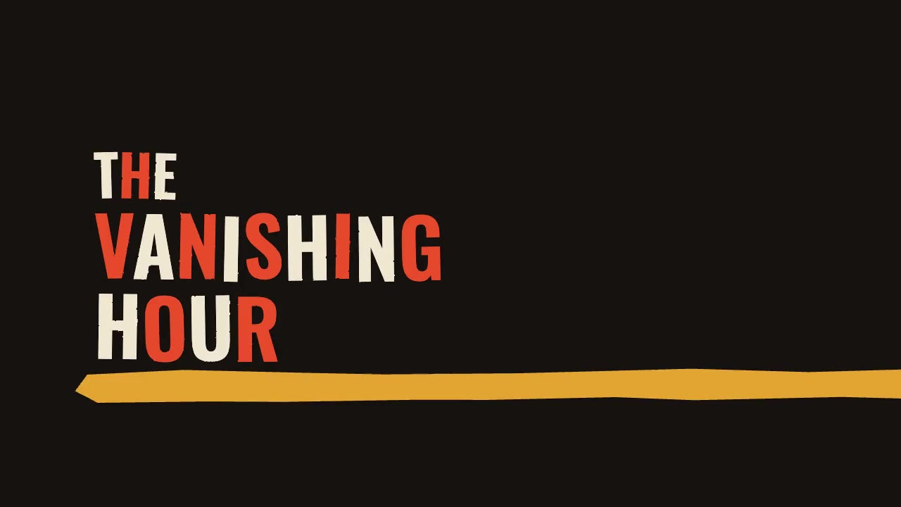
A jazz-tempo film title sequence in flat vermilion, mustard, bone and black: hand-cut paper shards jab in on the beat,…
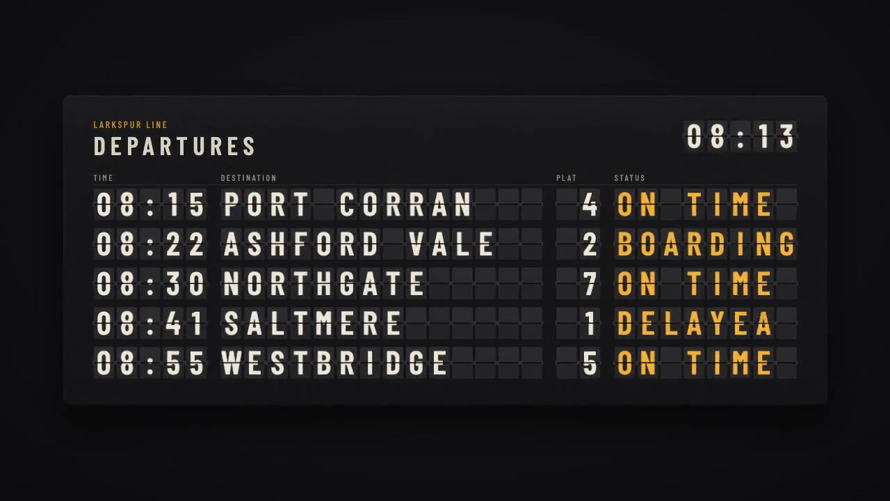
A mechanical station departure board where every flap steps through its drum to land on times, destinations and statuse…
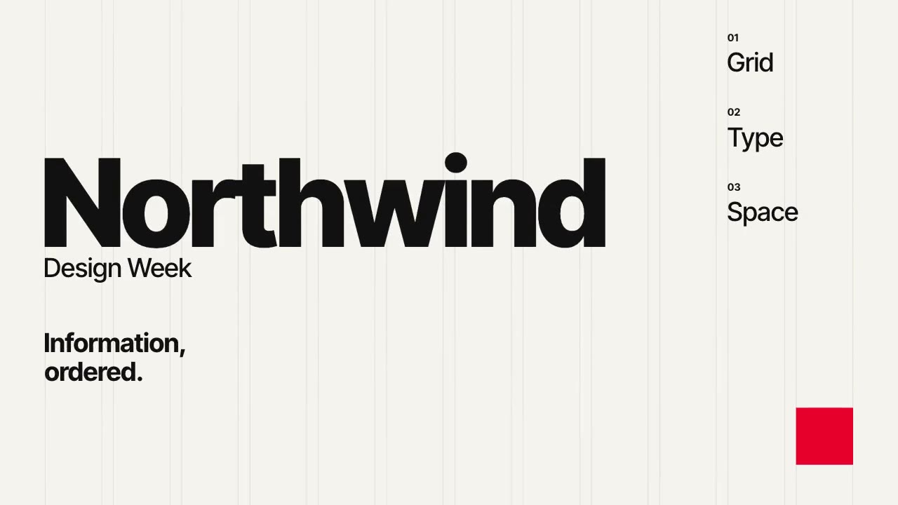
A Swiss-style event poster that builds itself on a visible 12-column grid: grotesque type rises out of baseline masks,…