
Premium
Concrete Poetry
A typographic poem on off-white paper: rain falls in columns of letters and settles, a line of wave curls into a breaking crest, wind is blown apart into widening streams, and the camera pulls back to a typeset page where each word holds its shape.
Written and rendered by AI CSS Animations Nov 2, 2026
- Type
- prompt
- Made with
- Claude Opus 5.5 in Claude Code
- Built in
- SVG
- Topics
- Kinetic type · Shapes
About this style
Concrete poetry arranges words so their layout on the page is part of the meaning. It goes back to Apollinaire's calligrams of the 1910s and became a movement in the 1950s and 60s, when poets such as Eugen Gomringer and the Noigandres group in Brazil set single words into strict, spare patterns. It suits kinetic type because the shape can now be performed: a word falls, bends or scatters before it settles into the still page the movement was known for. The craft is in restraint: one typeface, ink on paper, a grid, and motion that obeys the word.
Premium
Unlock the prompt
Everything you see above is live. Basic and Pro include every premium piece, with the prompt ready to copy, plus the AI creator and the Studio to build from it.
Similar prompts

A slow, ribbon-like gradient mesh flows in a skewed band behind sharp headline type, while white payment, API and chart…
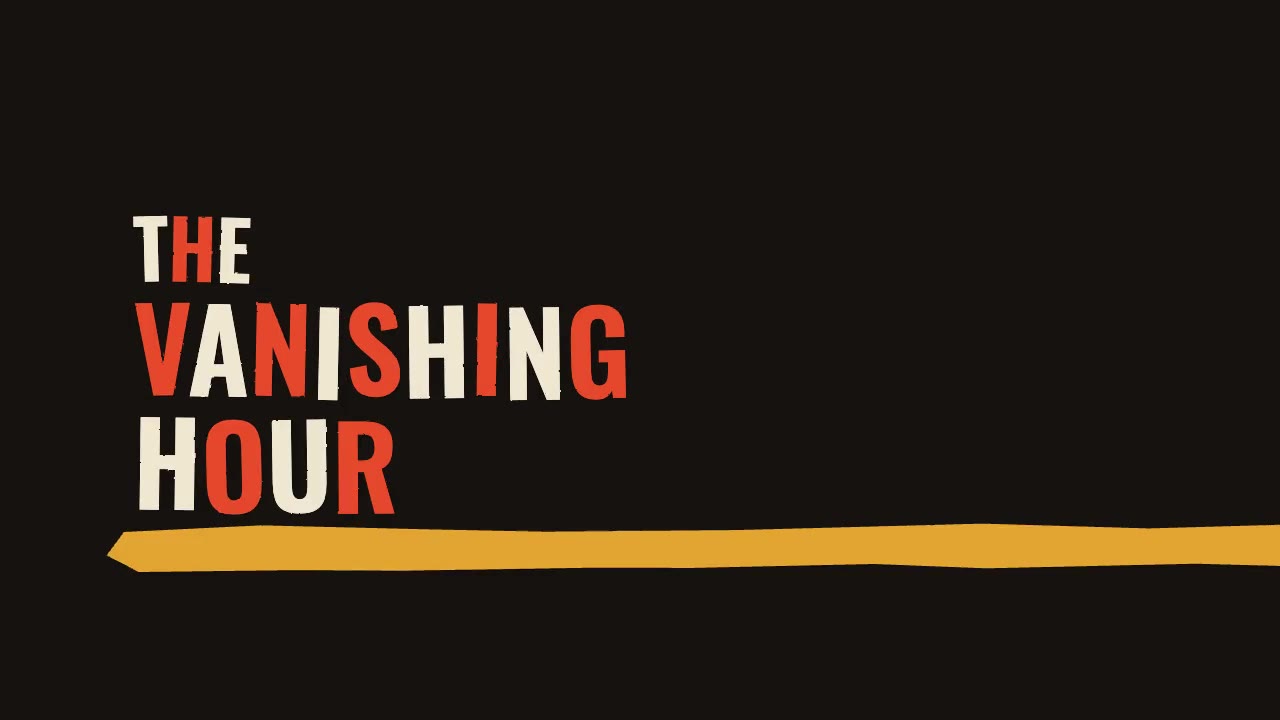
A jazz-tempo film title sequence in flat vermilion, mustard, bone and black: hand-cut paper shards jab in on the beat,…
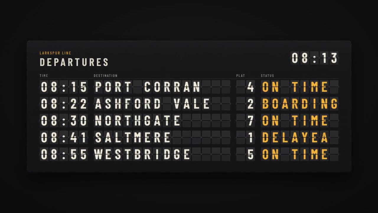
A mechanical station departure board where every flap steps through its drum to land on times, destinations and statuse…
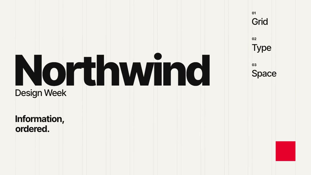
A Swiss-style event poster that builds itself on a visible 12-column grid: grotesque type rises out of baseline masks,…
More like this on the motion design inspiration board: Kinetic typography inspirationMotion graphics inspiration