
Light to Dark Theme Switch
A day-planner app flips from light to dark through a crisp circle growing out of its sun-and-moon toggle, every color token remapped rather than inverted, flips back, then settles on a split frame that shows both themes at once.
Written and rendered by AI CSS Animations Oct 16, 2026
- Type
- prompt
- Made with
- Claude Opus 5.5 in Claude Code
- Built in
- HTML/CSS
- Topics
- Product UI
About this style
Dark mode spread across operating systems and apps in the late 2010s, and the prefers-color-scheme media query lets websites follow the system setting. Well-made themes are built on design tokens, named roles such as surface, text and accent that map to a different value in each theme, so one switch remaps everything at once. A circle growing out of the toggle is a popular way to show the change, and design-system teams use it to prove both themes are complete.
The prompt
Make a 10-second interface animation: an app flips from light to dark through a circle growing out of its theme toggle, every color token remapped, then flips back.

<inputs>
If I don't give you something, use the default and don't ask.
- App: default "Daylark" (a day planner), showing Thursday
- Events: default 9:00 Planning (Work), 10:30 Design review (Work), 12:30 Lunch with Sami (Personal), 14:00 Focus block (Focus), 17:30 Climbing gym (Health)
- Side cards: default "Partly cloudy · 14°"; focus hours Mon–Thu 2.5, 3.0, 1.5, 2.0 (9.0 h)
- Closing line: default "Two themes, one design."
- Length: default 10 seconds
</inputs>

<direction>
- Tokens, light → dark: stage #E7E3DA → #0A0B0D; surface #FFFFFF → #15161A; sunken #F5F2EC → #0F1013; raised #FFFFFF plus a soft shadow → #1D1F24 plus a 1px rgba(255,255,255,0.06) border; border #E7E2D8 → #2A2C32; text #1A1916 → #ECEAE4; text-2 #6D6A63 → #A19E96; accent #D9480F → #FF8A4C. Event fill/text: Work #DCE7F7/#22457A → #1A2638/#9EC3F2; Personal #F7DCE0/#7D2B3A → #331C21/#F2A9B6; Focus #E1EED9/#2E5A26 → #1C2A1A/#A8D69B; Health #F5E8C7/#6B4E10 → #2E2715/#E9CB7C. Weather art: sky #CFE3F2 → #1B2440, sun #F6B04A → moon #E9E4D2 with stars.
- Dark is designed, not inverted: raised surfaces get lighter, borders replace shadows, pastels become deep tints with light text.
- Type: Hanken Grotesk 400–700: day title 44px, events 22px, labels 20px, closing line 52px.
- Layout: a 1600×840 window at (160, 64); the toggle (76×40) centered at stage (1670, 100) in the title bar; a 300px sidebar (mini month, calendars); an hour grid 9:00–19:00 at 64px per hour; a right column with a drawn weather card and the focus bars, today in accent.
- Reveal: two full copies of the scene with different token sets; the incoming one is clipped by clip-path: circle(r at 1670px 100px), r growing 0 → 1940px in 0.95s on cubic-bezier(0.65, 0, 0.35, 1). A crisp edge ridden by a 1.5px ring of the incoming accent; inside, everything is fully the new theme, never an in-between color.
- Toggle, drawn once above both copies: the knob slides on a spring (stiffness 520, damping 34) as the sun's rays shrink away and a mask cuts the disc into a crescent. Cursor: an SVG arrow, ink with a white outline.
- Premium is two complete, separately tuned themes meeting at one crisp edge. Cheap is filter: invert(), a fade through grey, or light shadows left on dark surfaces.
Banned: invert or hue-rotate filters, color tweens between themes, blurred or glowing edges, pure black surfaces, shadows in dark mode, emoji, real OS or brand names, anything flashing more than 3 times per second.
</direction>

<structure>
- 0.0–1.2: Light. The window rises 32px (0.7s, cubic-bezier(0.22, 1, 0.36, 1)); columns rise 60ms apart; events slide in.
- 1.2–2.0: The cursor glides to the toggle and clicks.
- 2.0–2.95: Dark grows from the toggle over window and stage; the sun becomes a moon.
- 2.95–5.2: Dark. The cursor hovers "Design review", then the Thu bar ("Thu · 2.0 h" tooltip).
- 5.2–6.3: Click; light grows back from the toggle (1.0s).
- 6.3–7.3: The cursor leaves.
- 7.3–8.5: Dark grows once more and settles at r = 1050px (1.2s, cubic-bezier(0.16, 1, 0.3, 1)), its arc splitting the frame.
- 8.5–9.0: The closing line rises at x 160, baseline y 990, on the light side; pills "Light" and "Dark" sit either side of the arc.
- 9.0–10.0: Hold.
For other lengths, scale the beats, keep reveals 0.8–1.2s and hold at least 1s.
</structure>

<build>
One self-contained index.html (inline CSS and JS), a 1920×1080 (16:9) stage scaled to fit the window, built for 60fps. Google Fonts via <link>, awaiting document.fonts.load() for each face before defining window.seek. HTML/CSS with inline SVG, tokens as CSS custom properties; no canvas or three.js. window.seek(t) (t in seconds) sets every visual from t alone, clamping past the end: no CSS transitions or animations, no setTimeout/setInterval, no state carried between frames, randomness only from a seeded PRNG. Without ?render in the URL, drive seek from requestAnimationFrame; with ?render, don't start that loop.
</build>

<check>
Before showing me, step through one frame per second (0–10s) and look at each. Fix overlaps, clipped or cramped text and anything off-style or Banned. Mid-reveal, each side of the edge is fully one theme; text contrast is at least 4.5:1 in both. Confirm seek(10) and seek(11) match.
</check>
Ours, and free to use under CC0: copy it, change it, ship it. No credit needed.
Similar prompts
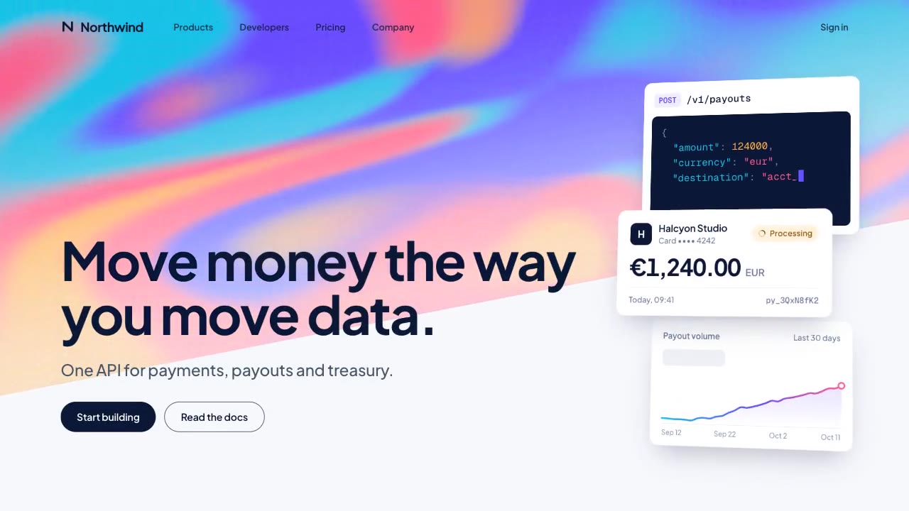
A slow, ribbon-like gradient mesh flows in a skewed band behind sharp headline type, while white payment, API and chart…
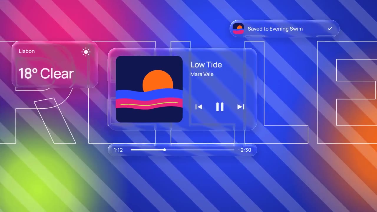
Glass panels with real refraction float over vivid, striped color: their rims bend what's behind them, two buttons fuse…
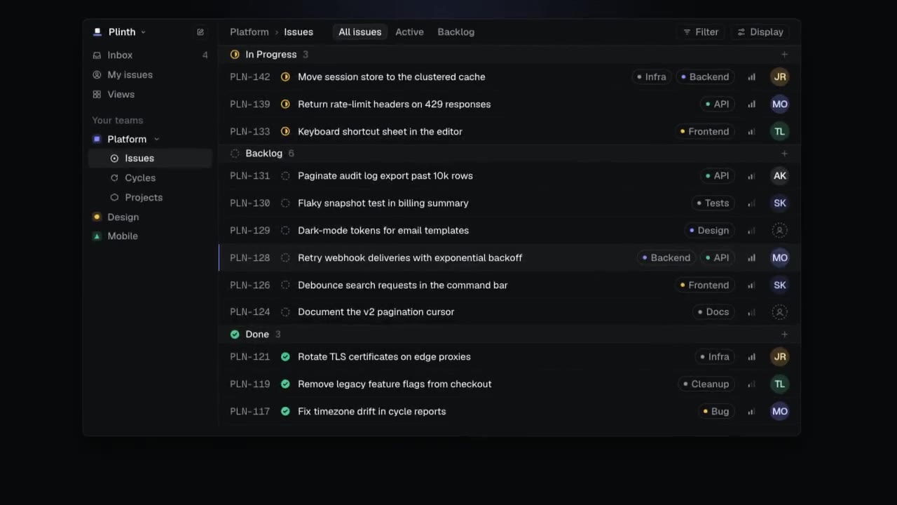
A dark-mode work tool drawn in hairlines and quiet radial glows: issue rows populate, ⌘K opens a command menu, a comman…
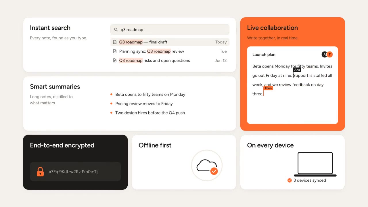
Rounded tiles spring into a bento grid on warm paper, each acting out one feature in a small animation, then the tiles…
More like this on the motion design inspiration board: UI animation inspiration